Quick Demo: EDA & Resampling to answer basic comparison questions#
This is as a quick illustration of how we can combine our previous lessons about resampling and our skills with Tidy Data to get an answer to a specific question.
This example should serve as a guide for how you might approach some of the questions you’ll be asked to do in HW 2.
We’ll use the starwars.csv file that you’ll explore in 03_challenge.ipynb to answer the following question:
For non-human species on average, who is taller: males or females?#
import polars as pl
from polars import col
import seaborn as sns
Let’s load the file and print the first few rows:
# Solution
sw = pl.read_csv('starwars.csv')
sw.head()
| name | height | mass | hair_color | skin_color | eye_color | birth_year | sex | gender | homeworld | species |
|---|---|---|---|---|---|---|---|---|---|---|
| str | f64 | f64 | str | str | str | f64 | str | str | str | str |
| "Luke Skywalker" | 172.0 | 77.0 | "blond" | "fair" | "blue" | 19.0 | "male" | "masculine" | "Tatooine" | "Human" |
| "C-3PO" | 167.0 | 75.0 | null | "gold" | "yellow" | 112.0 | "none" | "masculine" | "Tatooine" | "Droid" |
| "R2-D2" | 96.0 | 32.0 | null | "white, blue" | "red" | 33.0 | "none" | "masculine" | "Naboo" | "Droid" |
| "Darth Vader" | 202.0 | 136.0 | "none" | "white" | "yellow" | 41.9 | "male" | "masculine" | "Tatooine" | "Human" |
| "Leia Organa" | 150.0 | 49.0 | "brown" | "light" | "brown" | 19.0 | "female" | "feminine" | "Alderaan" | "Human" |
Then let’s filter the data down to non-human males and females only:
filtered = sw.filter(
    (~col('species').eq('Human')) & (col('sex').is_in(['female','male']))
    )

filtered
| name | height | mass | hair_color | skin_color | eye_color | birth_year | sex | gender | homeworld | species |
|---|---|---|---|---|---|---|---|---|---|---|
| str | f64 | f64 | str | str | str | f64 | str | str | str | str |
| "Chewbacca" | 228.0 | 112.0 | "brown" | "unknown" | "blue" | 200.0 | "male" | "masculine" | "Kashyyyk" | "Wookiee" |
| "Greedo" | 173.0 | 74.0 | null | "green" | "black" | 44.0 | "male" | "masculine" | "Rodia" | "Rodian" |
| "Yoda" | 66.0 | 17.0 | "white" | "green" | "brown" | 896.0 | "male" | "masculine" | null | "Yoda's species" |
| "Bossk" | 190.0 | 113.0 | "none" | "green" | "red" | 53.0 | "male" | "masculine" | "Trandosha" | "Trandoshan" |
| "Ackbar" | 180.0 | 83.0 | "none" | "brown mottle" | "orange" | 41.0 | "male" | "masculine" | "Mon Cala" | "Mon Calamari" |
| … | … | … | … | … | … | … | … | … | … | … |
| "San Hill" | 191.0 | null | "none" | "grey" | "gold" | null | "male" | "masculine" | "Muunilinst" | "Muun" |
| "Shaak Ti" | 178.0 | 57.0 | "none" | "red, blue, white" | "black" | null | "female" | "feminine" | "Shili" | "Togruta" |
| "Grievous" | 216.0 | 159.0 | "none" | "brown, white" | "green, yellow" | null | "male" | "masculine" | "Kalee" | "Kaleesh" |
| "Tarfful" | 234.0 | 136.0 | "brown" | "brown" | "blue" | null | "male" | "masculine" | "Kashyyyk" | "Wookiee" |
| "Tion Medon" | 206.0 | 80.0 | "none" | "grey" | "black" | null | "male" | "masculine" | "Utapau" | "Pau'an" |
Now let’s summarize the data by calculating the mean and median of the height column separately for males and females.
We an use a .group_by to do this
filtered.group_by('sex').agg(
    height_mean = col('height').mean(),
    height_median = col('height').median(),
)
| sex | height_mean | height_median |
|---|---|---|
| str | f64 | f64 |
| "female" | 179.571429 | 178.0 |
| "male" | 176.911765 | 189.0 |
That’s interesting - it looks like male non-humans have a lower mean height than females, but not a lower median height.
But these summary statistics don’t tell us about the distrubution of heights by sex. So let’s visualize those using sns.catplot
sns.catplot(
    data=filtered,
    kind='swarm',
    x='sex',
    y='height',
    hue='sex',
)
<seaborn.axisgrid.FacetGrid at 0x1460e0d50>
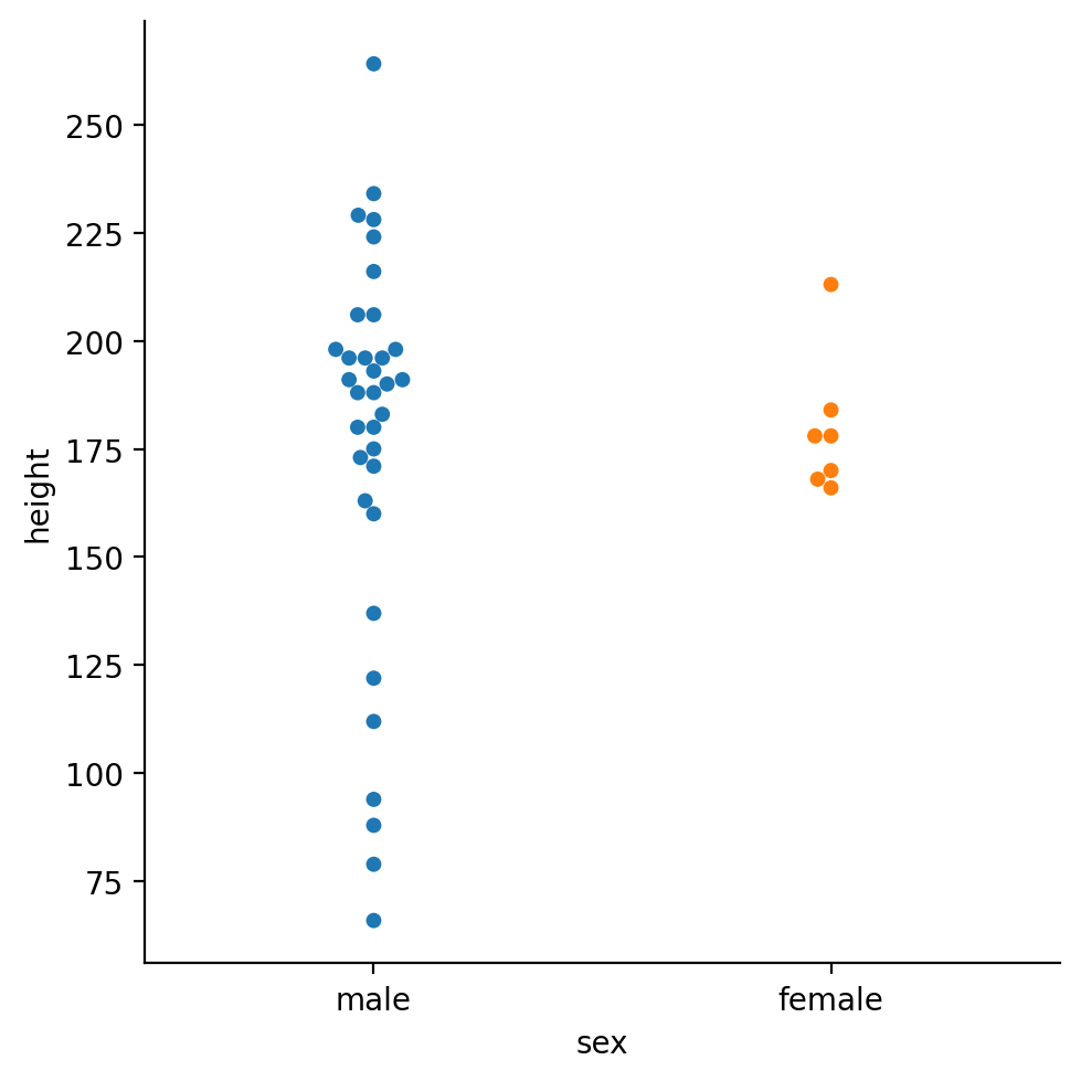
Interesting the male character look like their heights are more spread out. We also have many more observations of male heights than female heights.
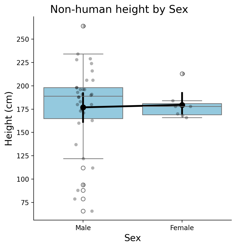
Let’s make a nice summary figure that combines the distributions of heights with summary statistics.
We’ll use layers to combine:
A stripplot with
color = 'black', alpha = 0.3A boxplot with
color = 'skyblue'A pointplot with
color = 'black'
Hint: Look at the “layering plots” section of the tutorial notebook and use grid.map()
# Setup grid with data
grid = sns.FacetGrid(
    data= filtered,
    height=5,
    aspect=1
)

# Strip - each individual character
grid.map(sns.stripplot,'sex','height', order=['male','female'], color='black', alpha=0.3)

# Box - medians
grid.map(sns.boxplot,'sex','height', order=['male','female'], color='skyblue')

# Points - averages
grid.map(sns.pointplot,'sex','height', order=['male','female'], color='black')

# Labels
grid.set_axis_labels('Sex', 'Height (cm)', fontsize=14)
grid.set_xticklabels(['Male', 'Female'])
grid.figure.suptitle('Non-human height by Sex', fontsize=16, y=1.02)
<seaborn.axisgrid.FacetGrid at 0x1654cbb90>
<seaborn.axisgrid.FacetGrid at 0x1654cbb90>
<seaborn.axisgrid.FacetGrid at 0x1654cbb90>
<seaborn.axisgrid.FacetGrid at 0x1654cbb90>
<seaborn.axisgrid.FacetGrid at 0x1654cbb90>
Text(0.5, 1.02, 'Non-human height by Sex')
Now let’s try to use resampling to compare these groups.
One way we can do this is by asking: how likely are we to observe this average difference if characters were randomly assigned to one of the two sexes?
We can simulate this by resampling without replacement, i.e. permuting the sex label across characters, re-calculating the mean difference, and then repeating this process many times.
We can use the permutation_test function, which needs us to give it:
a tuple of the two groups we want to compare
a function that takes each group and returns the statistic we want to make an inference about
from scipy.stats import permutation_test
First lets get all the male and female heights, and store them in two new variables that we’ll give to permutation_test
We can do this by filtering rows by sex and selecting the height column, and converting the result to a numpy array:
males = filtered.filter(col('sex') == 'male').select('height').to_numpy()
males.shape
(34, 1)
Since the array is 2 dimensional (it was originally a column), we can use .squeeze() to remove the extra dimension we don’t need:
males = males.squeeze()
males.shape
(34,)
And repeat for females
females = filtered.filter(col('sex') == 'female').select('height').to_numpy().squeeze()
females.shape
(7,)
Then we’ll create a function that takes the mean difference between both groups:
import numpy as np

def mean_diff(x, y):
    return np.mean(x) - np.mean(y)
Now we have all the pieces that permutation_test needs so lets use it.
result = permutation_test(
    (males, females),             # <- this is a tuple!
    statistic=mean_diff,
    permutation_type='independent',
    n_resamples=1000
    )
Let’s create a simple matplotlib histogram to check out the result and plot the true mean difference
plt.hist(result.null_distribution);
plt.axvline(result.statistic, color='black', linestyle='--')
(array([  1.,   8.,  76., 180., 227., 243., 151.,  72.,  37.,   5.]),
 array([-59.33613445, -47.58739496, -35.83865546, -24.08991597,
        -12.34117647,  -0.59243697,  11.15630252,  22.90504202,
         34.65378151,  46.40252101,  58.1512605 ]),
 <BarContainer object of 10 artists>)
<matplotlib.lines.Line2D at 0x165404590>
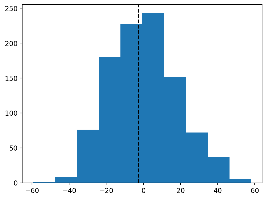
We can see that our observed mean difference (black line) is centered inside the null distribution we created by shuffling sex labels around.
The result.pvalue captures the proportion of times we’d observe a mean difference as large as ours if the null distribution were true, i.e. if sex labels were randomly assigned.
This suggests that we’d be pretty likely to observe this mean difference even if sex labels were shuffled - so we shouldn’t make much of it.
result.pvalue
0.9010989010989011
This quick example is meant to give you a sense of how to test a specific comparison, simply using some of the resampling approaches we learned about before.
Remember we also learned about the bootstrap function from scipy.stats that resamples with replacement to help us estimate our uncertainty about a statistical estimate and capture this in confidence intervals.
Keep these in mind, along with the .sample() method that Polars DataFrames have to help you with future data analysis tasks!