Models III: Multiple Regression with statsmodels#
Learning Goals#
In the previous notebook we learned how to use statsmodels to perform a univariate regression, i.e. 1 predictor variable. In this notebook we’re going to extend this to multiple regression that includes 2+ predictor variables. Specifically, we’re going to focus on continuous variables as we’ve been doing so far. In future notebooks, we’ll discuss how we can using the GLM to model categorical variables.
Estimating a multiple regression using OLS with
statsmodelsInterpreting parameter estimates
Interactions between predictor variables
Evaluating multi-collinearity - another modeling assumption
Revisiting centering predictor variables
Parameter inference via model comparison
Parameter inference via uncertainty estimation
Slides for reference#
Modeling Data I (slides)
Modeling Data II (slides)
Modeling Data II 1/2 (slides)
Data#
Let’s learn how to fit a multiple regression model using statsmodels.
We’ll be using a different dataset of advertisement spending on different types of media and the resulting sales generated. Here are the columns:
Variable |
Description |
|---|---|
tv |
TV ad spending in $1000 of dollars |
radio |
Radio ad spending in $1000 of dollars |
newspaper |
Newspaper ad spending in $1000 of dollars |
sales |
Sales generated in $1000 of dollars |
import numpy as np
import polars as pl
from polars import col
import seaborn as sns
import matplotlib.pyplot as plt
df = pl.read_csv('./data/advertising.csv')
df
| tv | radio | newspaper | sales |
|---|---|---|---|
| f64 | f64 | f64 | f64 |
| 230.1 | 37.8 | 69.2 | 22.1 |
| 44.5 | 39.3 | 45.1 | 10.4 |
| 17.2 | 45.9 | 69.3 | 9.3 |
| 151.5 | 41.3 | 58.5 | 18.5 |
| 180.8 | 10.8 | 58.4 | 12.9 |
| … | … | … | … |
| 38.2 | 3.7 | 13.8 | 7.6 |
| 94.2 | 4.9 | 8.1 | 9.7 |
| 177.0 | 9.3 | 6.4 | 12.8 |
| 283.6 | 42.0 | 66.2 | 25.5 |
| 232.1 | 8.6 | 8.7 | 13.4 |
Our Statistical Question#
The primary question we’re interested in answering is:
Can we predict sales better when we consider radio ads in addition to TV ads?
Or stated differently:
“Controlling” for TV ads, do radio ads explain any additional variance in sales?
We can formalize this as comparison between 2 models:
Remember multiple regression is yet another “flavor” of the GLM where we have more than one predictors variable \(X\) being used to model an outcome variable \(y\).

Visual Exploration#
Before you build any model you should always plot your data first. This will give you better idea of what your data looks like any any modeling choices you might make.
Let’s use seaborn to plot our data:
import seaborn as sns
import matplotlib.pyplot as plt # for customization
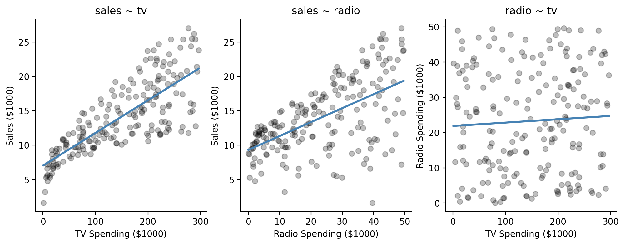
Let’s look at a scatterplot between each of \(X\) variables and our \(y\) variable.
We’ll also take a look at the relationship between the two \(X\) variables as well:
f, axs = plt.subplots(1,3, figsize=(12,4))

ax = sns.regplot(
    data=df,
    x='tv',
    y='sales',
    color='black',
    scatter_kws={'alpha': .25},
    ci=False,
    line_kws={'color': 'steelblue'},
    ax=axs[0]
)
ax.set(xlabel='TV Spending ($1000)', ylabel='Sales ($1000)', title="sales ~ tv");

ax = sns.regplot(
    data=df,
    x='radio',
    y='sales',
    color='black',
    scatter_kws={'alpha': .25},
    ci=False,
    line_kws={'color': 'steelblue'},
    ax=axs[1]
)
ax.set(xlabel='Radio Spending ($1000)', ylabel='Sales ($1000)', title="sales ~ radio");

ax = sns.regplot(
    data=df,
    x='tv',
    y='radio',
    color='black',
    scatter_kws={'alpha': .25},
    ci=False,
    line_kws={'color': 'steelblue'},
    ax=axs[2]
)
ax.set(xlabel='TV Spending ($1000)', ylabel='Radio Spending ($1000)', title="radio ~ tv");
sns.despine();
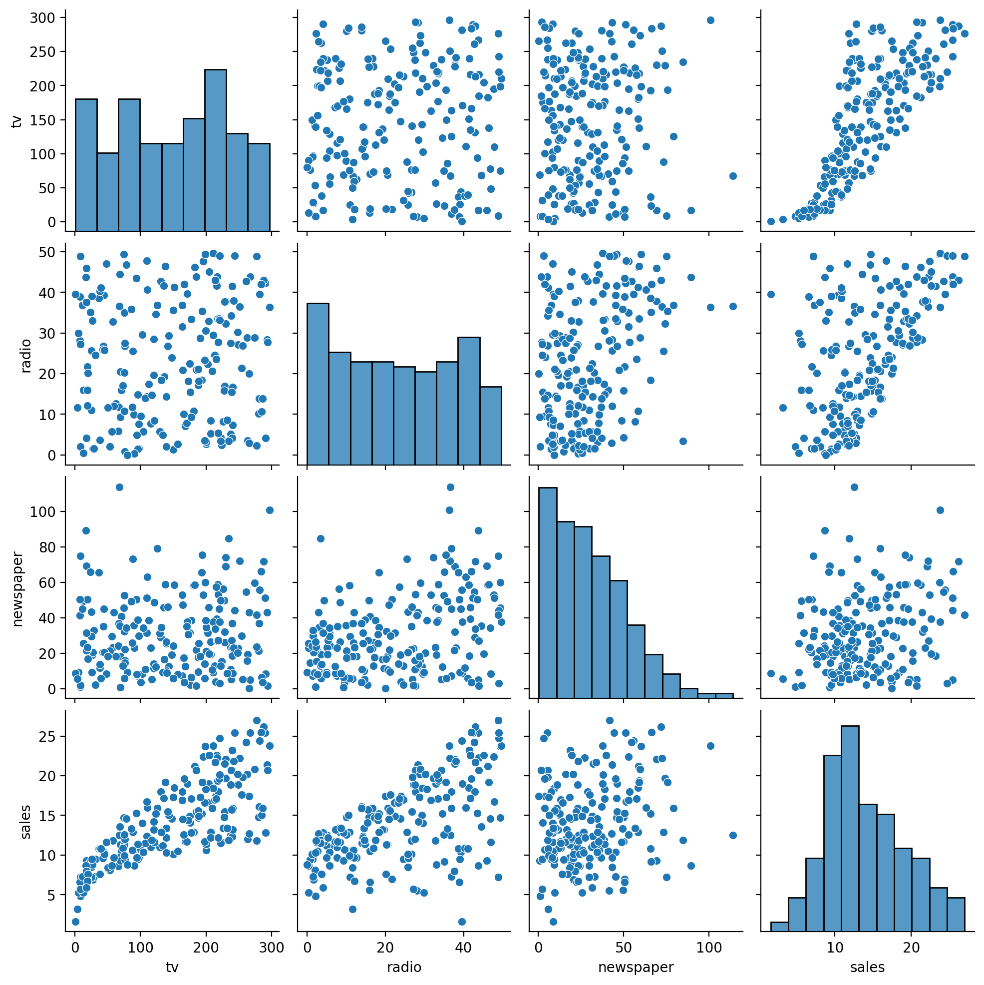
We can actually make this a lot easier and explore all the pairwise relationships in our data using seaborn’s pairplot function.
This also gives us the distribution of each variable. We an see that our \(y\), \(sales\) looks pretty normal, whereas \(newspaper\) looks a bit skewed, and \(tv\) and \(radio\) look pretty uniform
# We need to use .to_pandas() with pairplot
sns.pairplot(df.to_pandas())
<seaborn.axisgrid.PairGrid at 0x128255450>
Creating a heatmap of the correlation matrix between all variables is another great way to visualize pairwise relationships. First we’ll use .corr() in polars to calculate the pairwise correlation between all columns:
# Ask polars to correlate all pairs of columns
corr_mat = df.corr()

corr_mat
| tv | radio | newspaper | sales |
|---|---|---|---|
| f64 | f64 | f64 | f64 |
| 1.0 | 0.054809 | 0.056648 | 0.782224 |
| 0.054809 | 1.0 | 0.354104 | 0.576223 |
| 0.056648 | 0.354104 | 1.0 | 0.228299 |
| 0.782224 | 0.576223 | 0.228299 | 1.0 |
Then we can use seaborn’s heatmap to visualize this with options to pick a decent color palette and annotate the matrix with the r-values.
ax = sns.heatmap(
    corr_mat,
    cmap='vlag',
    vmin=-1,
    vmax=1,
    xticklabels=corr_mat.columns,
    yticklabels=corr_mat.columns,
    annot=True, fmt=".3f")
ax.set_title("Correlation Matrix");
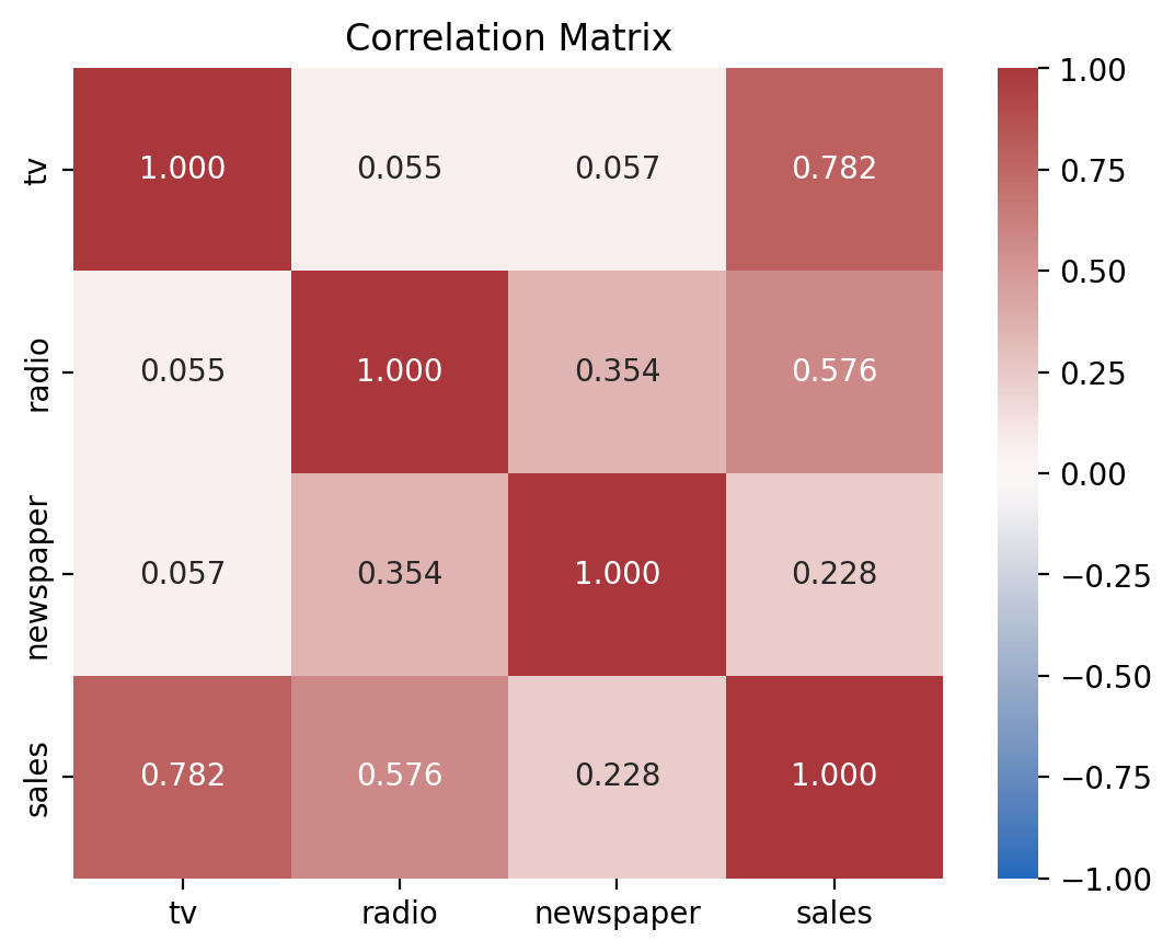
This tells us that:
\(r_{tv, sales} = 0.78\)
\(r_{radio, sales} = 0.58\)
\(r_{radio, tv} = 0.05\).
So both predictors (\(tv\) and \(radio\)) see to have some decently strong independent correlations with \(sales\).
And our two predictors don’t appear to be very correlated with each other (we will revisit this…)
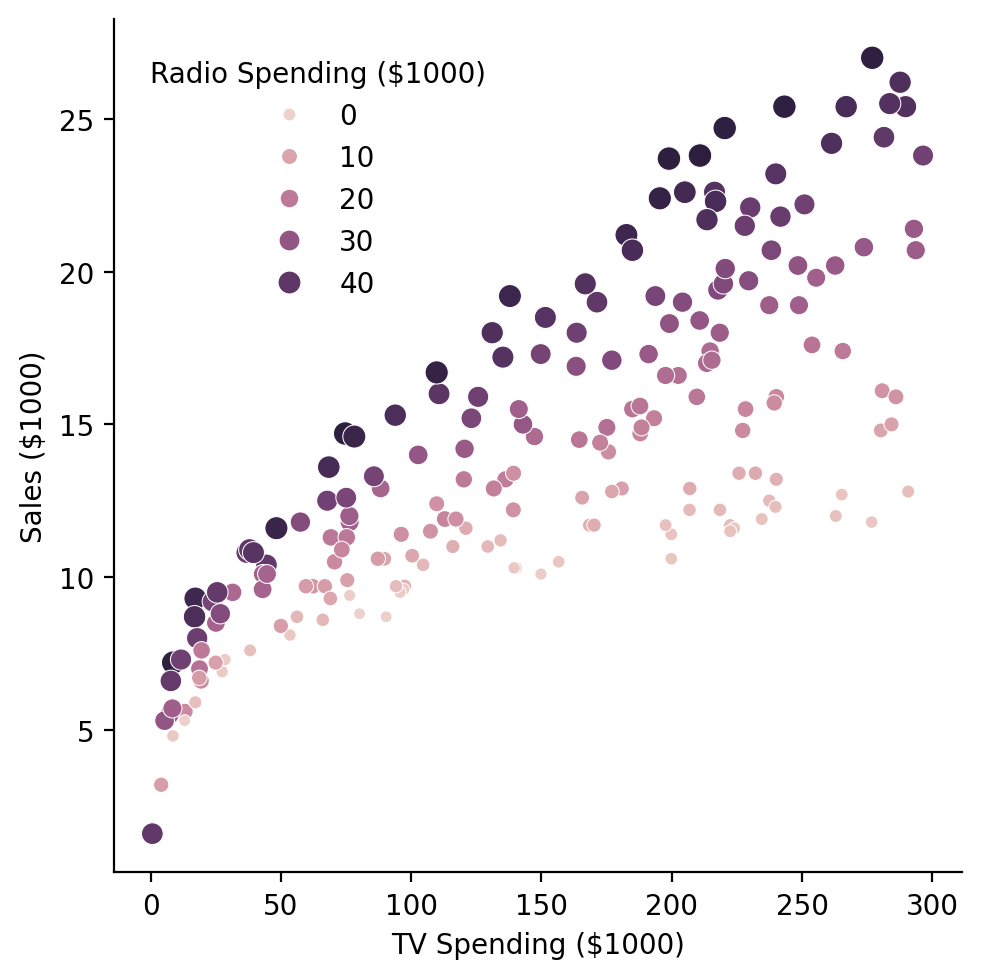
Another way we can look at these data is my mapping one of our continuous predictors to hue and size in a scatterplot. Since we’re interested in whether the addition of radio as a predictor changes our ability to predict sales, let’s put \(tv\) on the x-axis, \(sales\) on the y-axis, and \(radio\) on the hue.
Visualized this way it looks like the relationship between \(TV\) and \(sales\) might get steeper as \(radio\) increases.
grid = sns.relplot(
    data=df,
    kind='scatter',
    x='tv',
    y='sales',
    hue='radio',
    size='radio',

)
grid.set(xlabel='TV Spending ($1000)', ylabel='Sales ($1000)');
grid.legend.set_title('Radio Spending ($1000)');
grid.legend.set_bbox_to_anchor((.45, .8));
Estimation, Comparison, & Evaluation#
Let’s go ahead and formulate our hypothesis as a comparison between two models using ols, and then test whether adding \(radio\) as a predictor is worth it
Here’s what we’ll do:
Define each model using the
olsfunction and formula syntaxCall
.fit()on each model and save each model’s results to a new variableUse
anova_lm()to test our worth it question
from statsmodels.formula.api import ols
from statsmodels.stats.anova import anova_lm

# Only tv as a predictor
compact_model = ols('sales ~ tv', data=df)

# tv and radio as predictors
augmented_model = ols('sales ~ tv + radio', data=df)

compact_results = compact_model.fit()
augmented_results = augmented_model.fit()

anova_lm(compact_results, augmented_results)
| df_resid | ssr | df_diff | ss_diff | F | Pr(>F) | |
|---|---|---|---|---|---|---|
| 0 | 198.0 | 2102.530583 | 0.0 | NaN | NaN | NaN |
| 1 | 197.0 | 556.913980 | 1.0 | 1545.616603 | 546.738781 | 9.776972e-59 |
Looking at our p-value and F statistic it seems worth it!
Now let’s evaluate how the model is actually performing.
Like the previous notebook, we’ll add some columns to our DataFrame to store the predictions and the residuals for easier plotting.
df = df.with_columns(
    residuals = augmented_results.resid.to_numpy(),
    predicted_sales = augmented_results.fittedvalues.to_numpy(),
)
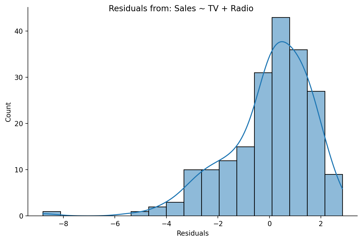
Let’s look at the shape of the histogram for normality…not too bad but skewed
grid = sns.displot(data=df,x='residuals',height=5,aspect=1.5, kde=True)
grid.set_axis_labels('Residuals','Count');
grid.figure.suptitle('Residuals from: Sales ~ TV + Radio');
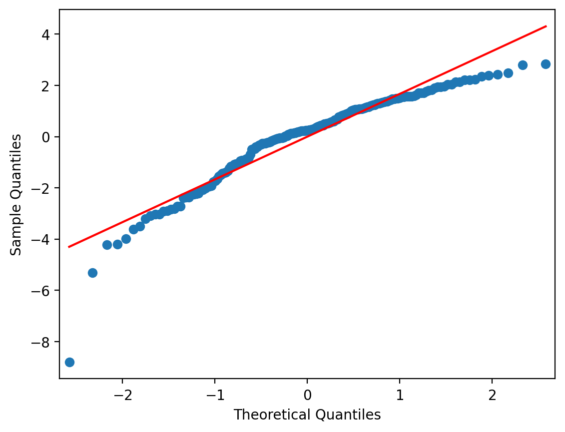
And the qqplot shows the same:
from statsmodels.graphics.gofplots import qqplot

qqplot(df['residuals'], line = 's');
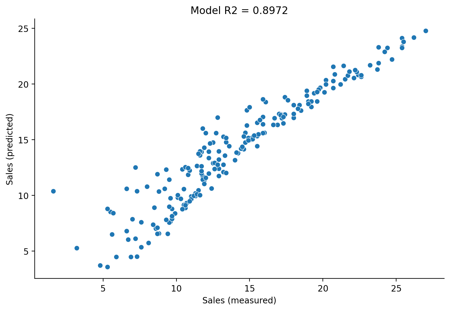
Finally plotting \(sales\) against \(\hat{sales}\) gives us sense of overall fit to the data. We can also fetch the \(R^2\) value that statsmodels calculates for us to put it in the title:
grid = sns.relplot(
    data=df,
    x="sales",
    y="predicted_sales",
    kind='scatter',
    height=5,
    aspect=1.5,
)

# Labels and legend
grid.set_axis_labels('Sales (measured)', 'Sales (predicted)');
grid.set(title=f"Model R2 = {augmented_results.rsquared:.4f}");
Parameter Interpretation#
Lastly, let’s use .summary() to get a sense of the parameter estimates and their uncertainty:
print(augmented_results.summary())
                            OLS Regression Results
==============================================================================
Dep. Variable:                  sales   R-squared:                       0.897
Model:                            OLS   Adj. R-squared:                  0.896
Method:                 Least Squares   F-statistic:                     859.6
Date:                Wed, 12 Feb 2025   Prob (F-statistic):           4.83e-98
Time:                        16:48:22   Log-Likelihood:                -386.20
No. Observations:                 200   AIC:                             778.4
Df Residuals:                     197   BIC:                             788.3
Df Model:                           2
Covariance Type:            nonrobust
==============================================================================
                 coef    std err          t      P>|t|      [0.025      0.975]
------------------------------------------------------------------------------
Intercept      2.9211      0.294      9.919      0.000       2.340       3.502
tv             0.0458      0.001     32.909      0.000       0.043       0.048
radio          0.1880      0.008     23.382      0.000       0.172       0.204
==============================================================================
Omnibus:                       60.022   Durbin-Watson:                   2.081
Prob(Omnibus):                  0.000   Jarque-Bera (JB):              148.679
Skew:                          -1.323   Prob(JB):                     5.19e-33
Kurtosis:                       6.292   Cond. No.                         425.
==============================================================================

Notes:
[1] Standard Errors assume that the covariance matrix of the errors is correctly specified.
Here’s how the output relates to out original original model equation:
And here’s how we’d report this:
For a given amount of TV advertising, an additional $1000 spending on radio advertising is associated with an increase in sales by 188 units.
Note: The \(1000 spending and 188 units are due the the *measurement scale* of our variables - they're reported in "units of \)1000 of spending” so we shift everything over by 3 decimal places (x1000) to make interpretation easier.
Marginal predictions#
To get a better idea of the relationship between \(sales\) and any of our predictors, we can generate marginal predictions. These are predicted values (\(\hat{sales}\)) when we hold one or more of the predictors at a constant value.
We can use the .predict() method on a model’s results to generate predictions given some input of the original predictor variables. These should be specified as a dictionary, where the keys are the names of the predictors (column names in our original DataFrame or in our model formula) and the values are the values to hold them at.
Let’s see an example of making this prediction:
augmented_results.predict(dict(
    tv=100,
    radio=0
))
0    7.496581
dtype: float64
This tells us that \(\hat{sales} = 7.49\) or
We can also generate multiplep predictions at once by giving .predict an array or list of predictor values.
We’ll generate predictions for \(sales\) using our observed values for \(tv\), but hold \(radio = 0\)
# Save to variable just to make coding easier
tv = df['tv'].to_numpy()

# We use all values in the TV column
# And just a bunch of 0s for radio
y_radio_0 = augmented_results.predict(dict(
    tv=tv,
    radio=np.repeat(0, len(tv))
    ))
This gives us 200 \(\hat{sales}\) predictions using our estimated coefficients but specifically when we set \(radio =0\).
y_radio_0
0      13.449283
1       4.957189
2       3.708083
3       9.852954
4      11.193570
         ...
195     4.668934
196     7.231203
197    11.019702
198    15.897165
199    13.540792
Length: 200, dtype: float64
Let’s repeat this process and update one of our first scatterplots:
grid = sns.relplot(
    data=df,
    kind='scatter',
    x='tv',
    y='sales',
    hue='radio',
    size='radio',

)
grid.set(xlabel='TV Spending ($1000)', ylabel='Sales ($1000)');
grid.legend.set_title('Radio Spending ($1000)');
grid.legend.set_bbox_to_anchor((.45, .8));
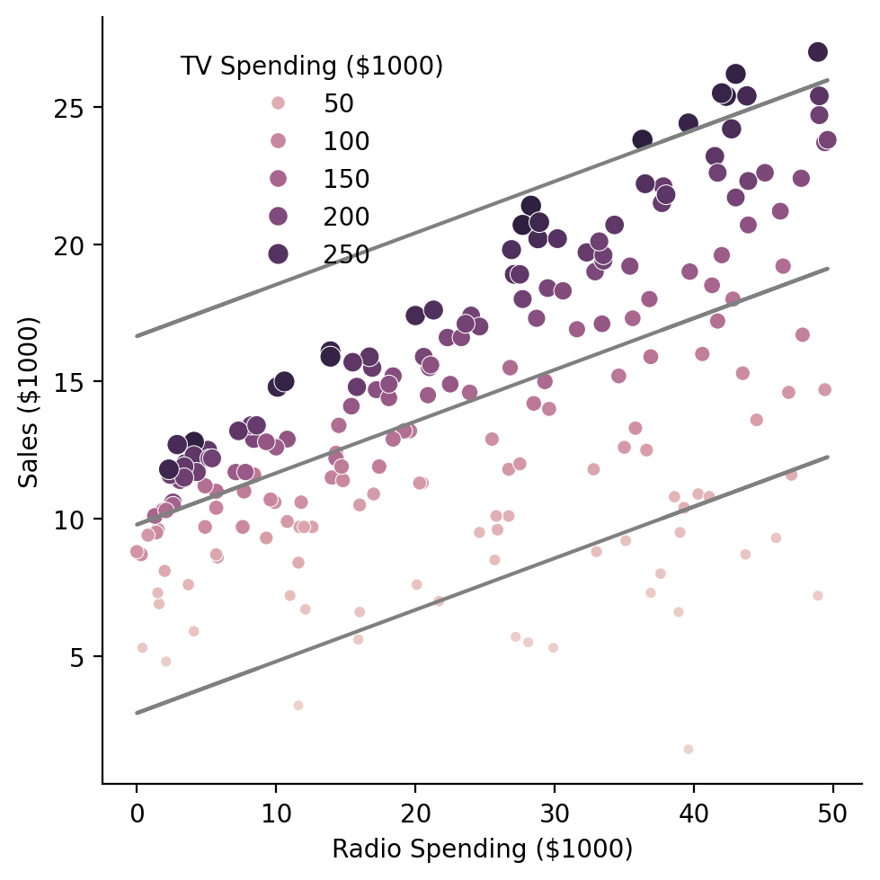
To get a better sense of the changing relationship between \(tv\) and \(sales\) across different values of \(radio\), we create 3 sets of predictions and plot them as lines:
# We use all values in the TV column a bunch of 20s for radio
y_radio_20 = augmented_results.predict(dict(
    tv=tv,
    radio=np.repeat(20, len(tv))
    ))

# We use all values in the TV column a bunch of 40s for radio
y_radio_40 = augmented_results.predict(dict(
    tv=tv,
    radio=np.repeat(40, len(tv))
    ))
grid = sns.relplot(
    data=df,
    kind='scatter',
    x='tv',
    y='sales',
    hue='radio',
    size='radio',

)
grid.set(xlabel='TV Spending ($1000)', ylabel='Sales ($1000)');
grid.legend.set_title('Radio Spending ($1000)');
grid.legend.set_bbox_to_anchor((.45, .8));

# Add them to the plot
grid.ax.plot(tv, y_radio_0, color='gray');
grid.ax.plot(tv, y_radio_20, color='gray');
grid.ax.plot(tv, y_radio_40, color='gray');
This gives is a good sense of our how our prediction change when we tweak the values of one our parameters.
Response Challenge#
Notice in the plot above that the slopes of the predicted lines are not changing - it looks like only the intercept is shifting up or down.
Can you provide an explanation why? What is our model failing to capture and how might we fix this? (we’ll revisit this in another notebook)
Your answer here
We’re not modeling an interaction between TV and Radio!
Marginal predictions are what the estimates mean#
Remember in the last notebook, we mentioned that in GLM, we interpret each parameter estimate assuming other parameter estimates = 0?
To prove this to you let’s take a look at our estimated slope for TV \(\hat{\beta}_1\)
augmented_results.params
Intercept    2.921100
tv           0.045755
radio        0.187994
dtype: float64
Ignoring the dollar $ scale of our data for a moment, this tell us that:
When \(radio\) spending = \(0\), for each unit-change in \(tv\) spending we expect a unit-change of \(0.457\) in \(sales\)
Let’s use a model to build our intuitions
That statement is about the slope of \(tv\) when predicting \(sales\) right?
Well we recently learned how estimate the slope of a line between two variables… we can use ols to estimate a univariate regression between predicted_sales ~ tv!
Specifically we’ll use the y_radio_0 variable we created earlier which is the predicted sales when we set radio = 0.
Let’s start by creating a new DataFrame with our predictions and original TV values:
df_predicted = pl.DataFrame({
    'tv': df['tv'].to_numpy(),            # original TV column
    'sales_predicted': y_radio_0          # From calling .predict() with radio = %
})
df_predicted.head()
| tv | sales_predicted |
|---|---|
| f64 | f64 |
| 230.1 | 13.449283 |
| 44.5 | 4.957189 |
| 17.2 | 3.708083 |
| 151.5 | 9.852954 |
| 180.8 | 11.19357 |
Then lets estimate this model and check out the slope for TV:
marginal_model = ols('sales_predicted ~ tv', data=df_predicted.to_pandas())

marginal_results = marginal_model.fit()

marginal_results.params
Intercept    2.921100
tv           0.045755
dtype: float64
See how it hasn’t changed? That’s because the slope for each parameter is interpreted fixing the other parameters to 0!
Marginal predictions/plots are what the slope for each parameter is capturing:
how much \(y\) changes with one unit change of \(x\) when all other \(X\) are held constant (at 0 by default)
Let’s see the same thing for the \(radio\) variable:
radio = df['radio'].to_numpy()

df_predicted = pl.DataFrame({
    'radio': radio,
    'sales_predicted': augmented_results.predict(dict(
        tv=np.repeat(0, len(radio)), radio=radio))
})

marginal_model = ols('sales_predicted ~ radio', data=df_predicted.to_pandas())
marginal_results = marginal_model.fit()
marginal_results.params
Intercept    2.921100
radio        0.187994
dtype: float64
Key takeaways#
“Marginal” or “adjusted” predictions are \(\hat{y}\) where we “fix” all parameters except one to a specific value and then ask our model to make predictions
In our example above, we fixed \(radio = 0\) and generated predictions using only the values of \(tv\) or visa-versa
These predictions are what our parameter estimates are telling us: how much the dependent variable changes with one unit change in a specific independent variable - when all other independent variables are held constant (at 0 by default)
Plotting Challenge#
Create another marginal predition plot like the one above, but flip the predictors around and add in some marginal predictions for when TV spending is 0, 150, and 300
Y-axis: Sales (same)
X-axis: Radio spending
Hue: TV spending
# Your code here
# Solution
grid = sns.relplot(
    data=df,
    kind='scatter',
    x='radio',
    y='sales',
    hue='tv',
    size='tv',

)
grid.set(xlabel='Radio Spending ($1000)', ylabel='Sales ($1000)');
grid.legend.set_title('TV Spending ($1000)');
grid.legend.set_bbox_to_anchor((.45, .8));

radio = df['radio'].to_numpy()

y_tv_0 = augmented_results.predict(dict(
    tv=np.repeat(0, len(tv)),
    radio=radio
    ))

y_tv_150 = augmented_results.predict(dict(
    tv=np.repeat(150, len(tv)),
    radio=radio
    ))

y_tv_300 = augmented_results.predict(dict(
    tv=np.repeat(300, len(tv)),
    radio=radio
    ))


# Add them to the plot
grid.ax.plot(radio, y_tv_0, color='gray');
grid.ax.plot(radio, y_tv_150, color='gray');
grid.ax.plot(radio, y_tv_300, color='gray');
Challenge 2#
Now we want to know whether spending money on newspaper ads is a good addition to our spending on TV and Radio ads.
Answer the question by completing the following exercises:
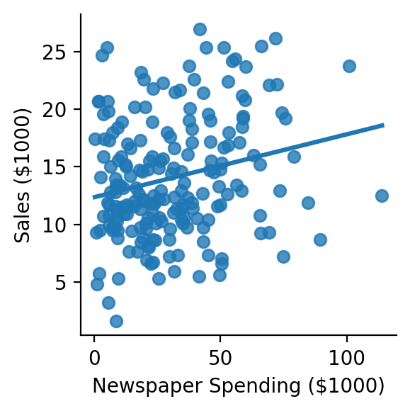
Use seaborn to explore and visualize the relationships between:
sales ~ newspaper
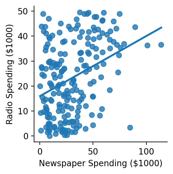
radio ~ newspaper
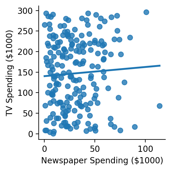
tv ~ newspaper
Feel free to use sns.lmplot, sns.Pairplot, and/or sns.heatmap to get a sense of these relationships.
# Your code here
# Solution
grid = sns.lmplot(
    data=df,
    x='newspaper',
    y='sales',
    ci=None,
    height=3

)
grid.set(xlabel='Newspaper Spending ($1000)', ylabel='Sales ($1000)');
# Solution
grid = sns.lmplot(
    data=df,
    x='newspaper',
    y='tv',
    ci=None,
    height=3

)
grid.set(xlabel='Newspaper Spending ($1000)', ylabel='TV Spending ($1000)');
# Solution
grid = sns.lmplot(
    data=df,
    x='newspaper',
    y='radio',
    ci=None,
    height=3

)
grid.set(xlabel='Newspaper Spending ($1000)', ylabel='Radio Spending ($1000)');
Estimate the pearson correlation for each relationship you visualized using the pearsonr function we imported for you below. You can find it’s help page here or use ? in your notebook cell
from scipy.stats import pearsonr

# Your code here
# Solution
r, p = pearsonr(df['newspaper'], df['sales'])

print(f"sales ~ newspaper: r = {r:.3f}, p = {p:.4f}")
sales ~ newspaper: r = 0.228, p = 0.0011
# Solution
r, p = pearsonr(df['newspaper'], df['tv'])

print(f"tv ~ newspaper: r = {r:.3f}, p = {p:.4f}")
tv ~ newspaper: r = 0.057, p = 0.4256
# Solution
r, p = pearsonr(df['newspaper'], df['radio'])

print(f"radio ~ newspaper: r = {r:.3f}, p = {p:.4f}")
radio ~ newspaper: r = 0.354, p = 0.0000
Estimate a multiple regression model with all 3 predictors using ols and use anova_lm to compare it to your previous augmented_results (i.e. model withou \(newspaper\))
# Your code here
twice_augmented_model = ols('sales ~ tv + radio + newspaper', data=df.to_pandas())
twice_augmented_results = twice_augmented_model.fit()

anova_lm(augmented_results, twice_augmented_results)
| df_resid | ssr | df_diff | ss_diff | F | Pr(>F) | |
|---|---|---|---|---|---|---|
| 0 | 197.0 | 556.913980 | 0.0 | NaN | NaN | NaN |
| 1 | 196.0 | 556.825263 | 1.0 | 0.088717 | 0.031228 | 0.859915 |
Does it seem worth it to add \(newspaper\) to the model?
Answer here…
Nope!
Inspect the output of .summary() for your new model and try to write up a natural English results summary:
# Your code here
print(twice_augmented_results.summary())
                            OLS Regression Results
==============================================================================
Dep. Variable:                  sales   R-squared:                       0.897
Model:                            OLS   Adj. R-squared:                  0.896
Method:                 Least Squares   F-statistic:                     570.3
Date:                Wed, 12 Feb 2025   Prob (F-statistic):           1.58e-96
Time:                        16:50:00   Log-Likelihood:                -386.18
No. Observations:                 200   AIC:                             780.4
Df Residuals:                     196   BIC:                             793.6
Df Model:                           3
Covariance Type:            nonrobust
==============================================================================
                 coef    std err          t      P>|t|      [0.025      0.975]
------------------------------------------------------------------------------
Intercept      2.9389      0.312      9.422      0.000       2.324       3.554
tv             0.0458      0.001     32.809      0.000       0.043       0.049
radio          0.1885      0.009     21.893      0.000       0.172       0.206
newspaper     -0.0010      0.006     -0.177      0.860      -0.013       0.011
==============================================================================
Omnibus:                       60.414   Durbin-Watson:                   2.084
Prob(Omnibus):                  0.000   Jarque-Bera (JB):              151.241
Skew:                          -1.327   Prob(JB):                     1.44e-33
Kurtosis:                       6.332   Cond. No.                         454.
==============================================================================

Notes:
[1] Standard Errors assume that the covariance matrix of the errors is correctly specified.
Description here…
For a given amount of TV advertising, an additional $1000 spending on radio advertising is associated with an incrase in sales by 188 units.
For a given amount of radio advertising, an additional $1000 spending on TV advertising is associated with an increase in sales by 45 units.
Newspaper advertising had no detectable association with sales, when accounting for TV and radio advertising.