01-13: Central Tendency#
NOTE: This notebook makes use of interactive notebook widgets which won’t appear if you’re viewing this notebook on the course website. Make sure to clone and run it locally using the Github Classroom link provided for this week!
Central Limit Theorem Recap#
The central limit theorem tells us that if we repeatedly take samples from a population and calculate a statistic like the mean for each sample, the distribution of these sample means will:
Be approximately normal, even if the original population is not.
Center around the true population mean.
Central Tendency#
In order to describe a sample we often care about its central tendency or the most “typical” or “central” value that represents a dataset. The most common measures of central tendency are:
Mode: The most frequent value
Mean: The arithmetic average
Median: The middle value when data are ordered
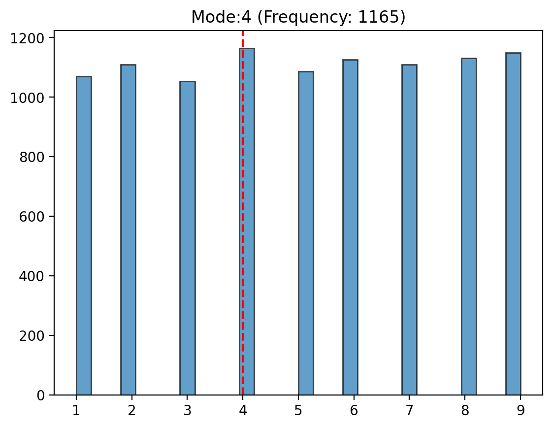
Mode#
The mode is the value that appears most frequently in a dataset. It is the simplest measure of central tendency and is often used for categorical data.
Formula#
For a dataset \((X = \{x_1, x_2, ..., x_n\})\), the mode \((M)\) satisfies: $\( M = \text{argmax}_x \; \text{Frequency}(x) \)$
Intuition#
The mode represents the most “popular” value in the data. While the mode is easy to understand and compute, it might not always exist (e.g., in uniform distributions) or might not be unique if multiple values occur with the same maximum frequency
Visual#
We’re going to use start to introduce some basic scientific python libraries here to make it easier to generate, summarize, and visualize random data. We’ll do more deep dives into these libraries later
import numpy as np # numerical library
from scipy import stats # basic statistical library
import matplotlib.pyplot as plt # basic plotting library

population_size = 10000

# We can quickly generate lists/arrays of numbers with numpyh
population = np.random.randint(1, 10, size=population_size)

# Calculate mode
mode_value, count = stats.mode(population)

# Visualize mode
plt.hist(population, bins=30, edgecolor="black", alpha=0.7);
plt.axvline(mode_value, color="red", linestyle="--");
plt.title(f"Mode:{mode_value} (Frequency: {count})");
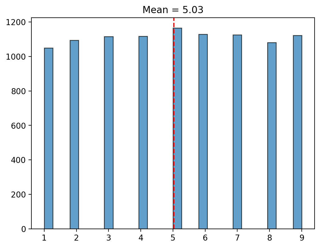
Mean#
The mean is the arithmetic average of a dataset and is one of the most commonly used measures of central tendency.
Formula#
For a dataset \((X = \{x_1, x_2, ..., x_n\})\), the mean \((\mu)\) is: $\( \mu = \frac{1}{n} \sum_{i=1}^n x_i \)$
Intuition#
The mean is often described as the “center of mass” of the data. It is sensitive to outliers, which can pull the mean away from the bulk of the data.
Visual#
import numpy as np # numerical library
from scipy import stats # basic statistical library
import matplotlib.pyplot as plt # basic plotting library

population_size = 10000

# We can quickly generate lists/arrays of numbers with numpy
population = np.random.randint(1, 10, size=population_size)

# Calculate mean
mean_value= np.mean(population)

# Visualize mean
plt.hist(population, bins=30, edgecolor="black", alpha=0.7);
plt.axvline(mean_value, color="red", linestyle="--")
plt.title(f"Mean = {mean_value:.2f}");
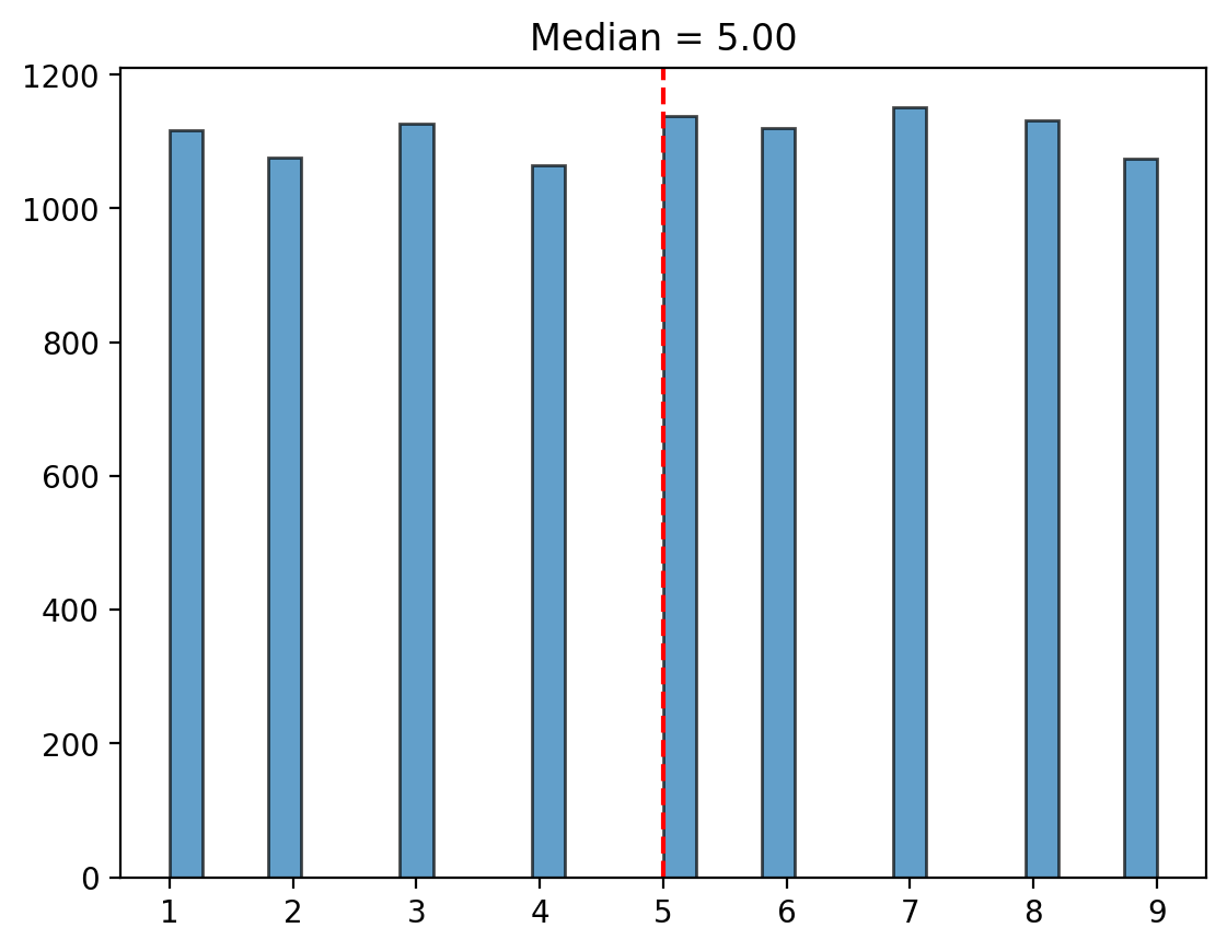
Median#
The median is the middle value of a dataset when it is sorted in ascending order. If the dataset has an even number of observations, the median is the average of the two middle values.
Formula#
For a sorted dataset \((X = \{x_1, x_2, ..., x_n\})\): $\( \text{Median} = \begin{cases} x_{(n+1)/2}, & \text{if } n \text{ is odd} \\ \frac{x_{n/2} + x_{n/2+1}}{2}, & \text{if } n \text{ is even} \end{cases} \)$
Intuition#
The median is known as a “robust measure” of central tendency because it’s less sensitive to outliers compared to the mean.
Visual#
import numpy as np # numerical library
from scipy import stats # basic statistical library
import matplotlib.pyplot as plt # basic plotting library

population_size = 10000

# We can quickly generate lists/arrays of numbers with numpy
population = np.random.randint(1, 10, size=population_size)

# Calculate median
median_value= np.median(population)

# Visualize median
plt.hist(population, bins=30, edgecolor="black", alpha=0.7);
plt.axvline(median_value, color="red", linestyle="--")
plt.title(f"Median = {median_value:.2f}");
Exercise#
Using the code examples above, along with numpy.random documentation to generate a few more figures that sample from alternative distributions
# EDIT ME!
import numpy as np # numerical library
from scipy import stats # basic statistical library
import matplotlib.pyplot as plt # basic plotting library

population_size = 10000

# Use np.random to generate a population from a different distribution
population =

# Calculate summary statistic
value =

# Visualize value
plt.hist(population, bins=30, edgecolor="black", alpha=0.7);
plt.axvline(value, color="red", linestyle="--")
plt.title(f"Statistic = {value:.2f}");
Two Cultures, Two Perspectives#
We can think about the Mean and Median in particular through both of the lens classical statistic and statistical learning we discussed last week:
Parameters of Distribution (Method of Moments): This classical approach describes key properties of probability distributions, focusing on population-level parameters like mean and variance.
Model Error (Statistical Learning): This modern approach focuses on minimizing prediction error and generalization to new data.
Let’s explore these paradigms, visualize their concepts, and expand on the ideas of bias, variance, and their trade-offs.
As parameters of a distribution (Method of Moments)#
The method of moments is a classical statistical approach emphasizing the understanding of distributions through their “moments” (mean, variance, skewness, etc.). This perspective is closely associated with Sir Francis Galton and Karl Pearson pioneers in statistical theory.
The perspective uses parameters like the mean/media to descibe the “shape” of a distribution
This perspective should feel more intuitive as it’s how we’ve been visualizing these ideas so far, and should feel familiar from previous courses you’ve taken.
As model error (Statistical Learning)#
In contrast to classical methods, statistical learning focuses on minimizing error to improve predictive performance. This paradigm was popularized by Leo Breiman in his seminal paper “Statistical Modeling: The Two Cultures” that we discussed in week 1.
From this perspective, parameters like the mean/media can be viewed as simple models that minimize different error metrics.
Mean: Minimizes Sum of Squared Errors (SSE).
Median: Minimizes Sum of Absolute Errors (SAE).
# Plot code
errors = np.linspace(-3, 3, 100)
sse = errors**2
sae = np.abs(errors)

plt.plot(errors, sse, label='Sum of Squared Errors (SSE)', color='red');
plt.plot(errors, sae, label='Sum of Absolute Errors (SAE)', color='green');
plt.title('Error Metrics: SSE vs SAE');
plt.xlabel('Error');
plt.ylabel('Loss');
plt.legend();
plt.show();
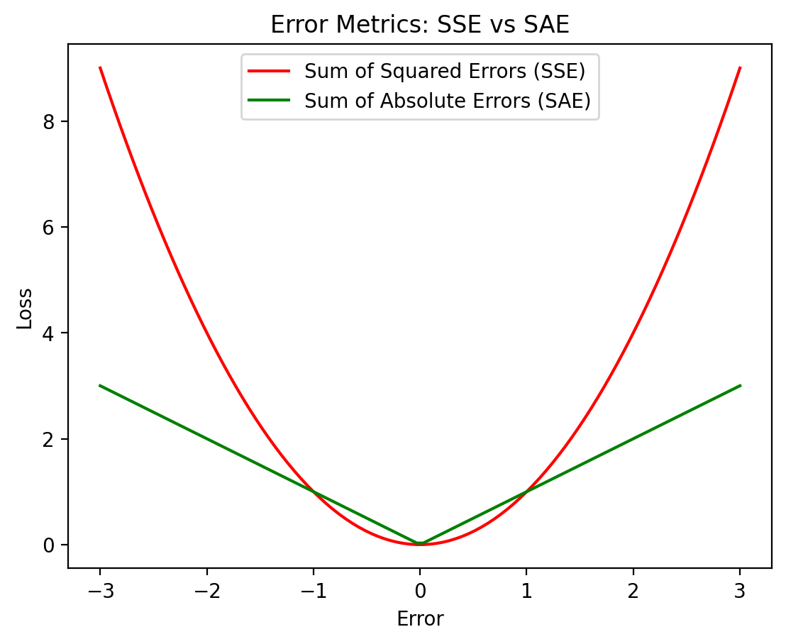
These metrics highlight different trade-offs in robustness and sensitivity:
Sum-of-Squared-Error (SSE), penalizes large errors more heavily (quadratically), making it sensitive to outliers
Sum-of-Absolute-Error (SAE), grows linearly with error, offering more robustness to outliers.
SSE, SAE, and connection to the Bias-Variance Tradeoff#
Remember that the total error of a model can be decomposed into three components:
Bias: Error introduced by approximating a real-world problem with a simplified model.
Variance: Error from model sensitivity to fluctuations in the training data.
Irreducible Error: Noise inherent in the data that cannot be eliminated.
When minimizing SSE, we prioritize reducing variance but may introduce larger bias, as outliers have a disproportionate influence.
As we build up to the General-Linear-Model, we’ll see how its most basic form (linear regression) takes this approach, minimizing SSE to favor more interpertable parameters with higher bias and lower variance
When minimizing SAE, we emphasize robustness, often resulting in lower bias when dealing with non-symmetric or skewed data (less influence of extreme observations) at the expensive of potentially higher variance compared to the mean.
NOTE: You can ignore the code below and just run the cell
# widget code
import numpy as np
import matplotlib.pyplot as plt
from ipywidgets import interact, FloatSlider


# Function to generate data and compute errors
def bias_variance_tradeoff(prop_outliers=0):
    np.random.seed(0)
    true_value = 0
    pop_size = 100
    outlier_factor = 1.0
    data = np.random.normal(loc=true_value, scale=1.0, size=pop_size)

    # Introduce an outliers
    num_outliers = int(prop_outliers * pop_size)
    outliers = np.array([4] * num_outliers)
    # outliers = np.array([outlier_factor] * num_outliers)
    data_with_outlier = np.hstack((data, outliers))
    # data_with_outlier = np.append(data, outlier_factor * 10)

    # Compute mean and median
    mean_prediction = np.mean(data_with_outlier)
    median_prediction = np.median(data_with_outlier)

    # Calculate SSE and SAE for mean and median
    sse_mean = np.sum((data_with_outlier - mean_prediction) ** 2)
    sae_median = np.sum(np.abs(data_with_outlier - median_prediction))

    # Plot data and predictions
    plt.figure(figsize=(10, 6))
    plt.hist(data_with_outlier, alpha=0.5, label="Data with Outlier")
    plt.axvline(
        true_value, color="black", linestyle="-", label=f"True Value: {true_value:.2f}"
    )
    plt.axvline(
        mean_prediction, color="red", linestyle="--", label=f"Mean (SSE: {sse_mean:.2f}"
    )
    plt.axvline(
        median_prediction,
        color="green",
        linestyle="--",
        label=f"Median (SAE: {sae_median:.2f})",
    )
    plt.title(
        f"True Value: {true_value:.2f}\nMean: {mean_prediction:.2f} Median: {median_prediction:.2f}"
    )
    plt.xlabel("Value")
    plt.ylabel("Frequency")
    plt.legend()
    plt.show()


# Create an interactive widget
interact(
    bias_variance_tradeoff,
    prop_outliers=FloatSlider(
        value=0.0, min=0.0, max=1.0, step=0.01, description="% Outliers"
    ),
)
<function __main__.bias_variance_tradeoff(prop_outliers=0)>
Next Time#
We’ll start to dive into using simulations to build intuitions and better understand summary statistics as estimators.
We’ll talk about Monte-carlo methods and discuss what the two major forms of resampling (with and without replacement) allow us to do.