Linear Mixed Models I: LMMs with pymer4#
Important:
Before running this notebook open a terminal, activate the 201b environment, and update the pymer4 package:
Open terminal
conda activate 201bpip install git+https://github.com/ejolly/pymer4.git --no-deps
Learning Goals#
Welcome to the last week of class and one of Eshin’s favorite topics: mixed models.
In the lab notebooks for week 6 we spent a lot of time understanding univariate and multiple regression via ols() using the statsmodels library. In this notebook we’re going to meet pymer4 a new Python library (written by Eshin) that allows us to estimate linear mixed effects models by interfacing with the gold standard R library lme4.
We won’t be covering the full functionality of pymer4 as it’s beyond the scope of this course.
Instead we’ll cover the fundamental of LMMs by exploring Simpson’s Paradox and the sleepstudy data we discussed in class.
We’ll focus on:
Understanding why we used LMMs vs regular regression
Exporing Simpson’s Paradox
Comparing pooled, unpooled, and partially pooled data aggregation approaches
Comparing different random-effects specifications for LMMs
Interpreting model output
Slides for reference#
Instructor’s Note#
Linear mixed models are vast topic and we can’t possible cover everything you need to know in the this course (especially with the limited time we have left). Instead please take note of the following excellent tutorial resources that will be very handy as you’re applying LMMs to your own (potentially more complicated) experimental designs and data. These links are also available on the course website, under the Overview page for Week 10.
Most of the materials you’ll find linked below (and generally when you’re googling online), will use the lme4 library in R. You can still follow these tutorials with a little patience converting the R code to the way that pymer4 does things in Python. We’ve included a table below for the most notable differences you’re likely to encounter.
Excellent Tutorial Resources#
Resources:
R vs Python#
Note: while the library we’ve been using for ols(), statsmodels does include some tools to estimate LMMs, we do not recommend using it for 2 reasons:
It can’t handle all the flavors of random effects offered by
lme4in RIt calculates p-values in an incredibly liberal way resulting in much higher Type I errors (false positive)
Python |
R |
Description |
|---|---|---|
|
|
create a model |
|
|
estimate model and get summary |
|
|
ANOVA style F-Tests; in R you have to setup contrasts properly; in |
|
|
setup custom categorical variable contrasts |
|
|
Compare models to see if fixed/random effects are worth it |
Key attributes/methods after fitting
Python |
R |
Description |
|---|---|---|
|
|
Level 2 Fixed effects estimates & t-stats; |
|
|
Level 1 Random effects (offsets from Level 2 Fixed effects) per cluster variable (e.g. intercepts & slope offsets per Subject) |
|
|
Level 1 Fixed Effect = Level 1 Random + Level 1 Fixed effects, (e.g. intercepts & slopes per Subject) |
|
|
post-hoc comparisons between levels of categorical variables |
# Import some libraries we typically use
import matplotlib.pyplot as plt
import seaborn as sns
import numpy as np
import polars as pl
from polars import col
sns.set_context('notebook')
Background#
GLM Assumptions#
Let’s remind ourselves of the core assumption of the General-Linear-Model: Idependent and Identitically Distributed errors (i.i.d)
This overall idea captures a few critical pieces that we’ve encountered in different forms:
Additivity & Linearity: assumes that the outcome \(y\) is a linear function of separate predictors \(\beta_0 + \beta_1X_1 +...\)
Normality: assumes that the residuals (\(y - \hat{y}\)) are normally distributed. It’s actually okay if the predictors
Homoscedasticity: assumes that the variance of our residuals doesn’t change as function of our predictors; we shouldn’t be getting more or less wrong (\(y - \hat{y}\)) depending upon what value our predictor \(X\) takes on; this matters a lot when we are using categorical predictors and calculating ANOVA statistics
No perfect multi-collinearity: assumes that our predictors are not just linear combinations of each other, otherwise we can’t figure out what the “unique variance” each one contributes to explaining \(y\)! and the outcome are non-normal, so long as the residuals are normal.
Assumption |
How to Notice |
Effect on Model |
Example Data |
|---|---|---|---|
Linearity |
Curved relationships in data plot |
Poor model fit |
Perceptual measurements, learning curves |
Homoscedasticity |
Residuals fan out in residual plot |
Incorrect standard errors |
Data with a huge range, e.g. 1-100000 |
Normality of Residuals |
Skewed residuals |
Invalid statistical tests |
Reaction times, income |
Multicollinearity |
Highly correlated predictors |
Inflated standard errors |
Z-score Standardization |
The last assumption we haven’t yet explore in previous notebooks is independence:
Independence of errors: assumes our residuals don’t depend upon each other; this gets violated when you have repeated-measures, time-series, geospatial, or multi-level
Violating Independence and Simpson’s Paradox#
Taking dependence in the data into account is extremely important. The Simpson’s paradox is an instructive example for what can go wrong when we ignore the dependence in the data.
Let’s start by loading some simulating some data to demonstrate the paradox.
df_simpson = pl.read_csv('data/simpson.csv')
df_simpson.head()
| participant | intercept | x | y |
|---|---|---|---|
| i64 | f64 | f64 | f64 |
| 1 | -9.103987 | 0.022867 | -9.45449 |
| 1 | -9.103987 | 0.025569 | -9.265862 |
| 1 | -9.103987 | 0.032425 | -9.687238 |
| 1 | -9.103987 | 0.032724 | -9.464708 |
| 1 | -9.103987 | 0.036451 | -9.37228 |
Let’s visualize the overall relationship between x and y with a simple linear model using sns.lmplot
sns.lmplot(data=df_simpson.to_pandas(), x='x', y='y', aspect=1.5, line_kws={'color': 'black'}, scatter_kws={'color': 'black'})
<seaborn.axisgrid.FacetGrid at 0x151bbbf50>
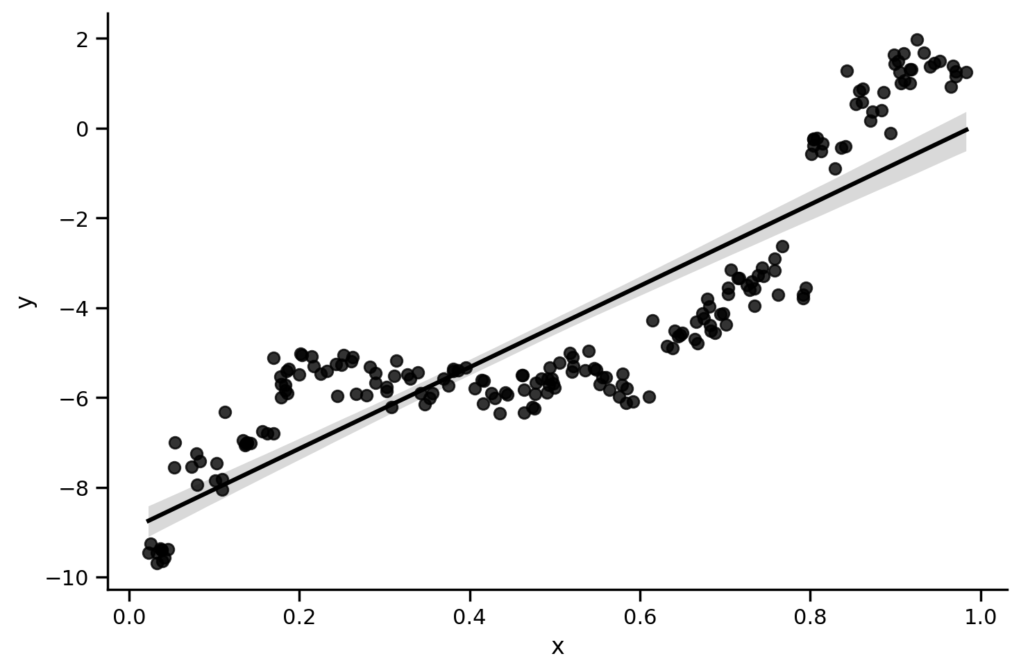
We can estimate the model using ols() and see that the overall relationship is positive and significant
from statsmodels.formula.api import ols

print(ols('y ~ x', data=df_simpson.to_pandas()).fit().summary(slim=True))
                            OLS Regression Results
==============================================================================
Dep. Variable:                      y   R-squared:                       0.778
Model:                            OLS   Adj. R-squared:                  0.777
No. Observations:                 200   F-statistic:                     693.0
Covariance Type:            nonrobust   Prob (F-statistic):           1.37e-66
==============================================================================
                 coef    std err          t      P>|t|      [0.025      0.975]
------------------------------------------------------------------------------
Intercept     -8.9538      0.199    -44.949      0.000      -9.347      -8.561
x              9.0688      0.344     26.325      0.000       8.389       9.748
==============================================================================

Notes:
[1] Standard Errors assume that the covariance matrix of the errors is correctly specified.
Let’s take another look at the data using different colors for different participants
grid = sns.FacetGrid(data=df_simpson.to_pandas(), height=5, aspect=1.5)
grid.map(sns.regplot, 'x', 'y', color='black')
grid.map_dataframe(sns.scatterplot, 'x', 'y', hue='participant', data=df_simpson.to_pandas(), palette='pastel', edgecolor='gray');
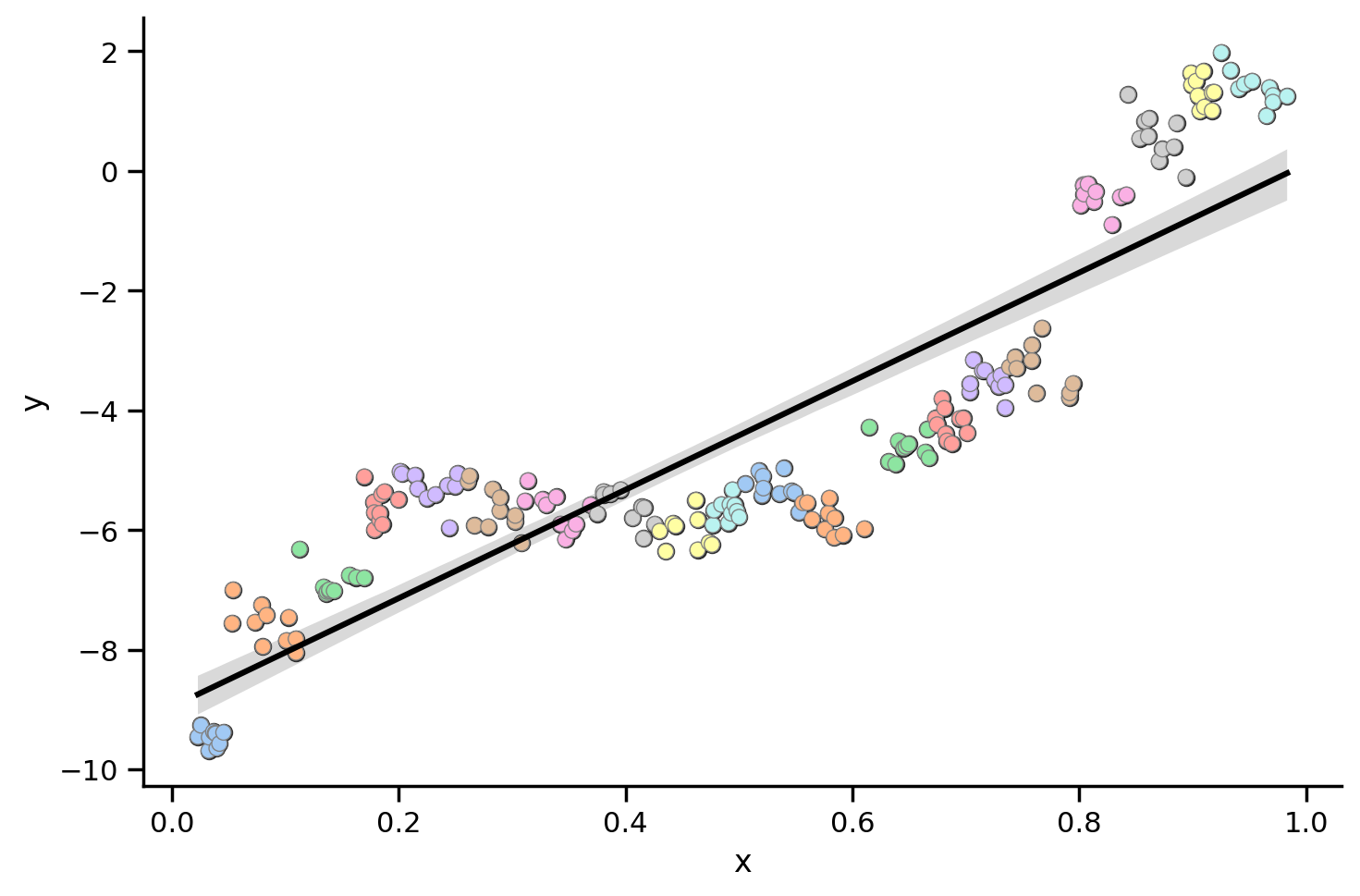
And fit a different regression line per particpant:
grid = sns.lmplot(data=df_simpson.to_pandas(), x='x', y='y', hue='participant', aspect=1.5, scatter_kws={'edgecolor': 'gray'}, palette='pastel', line_kws={'color': 'black'}, legend=False)
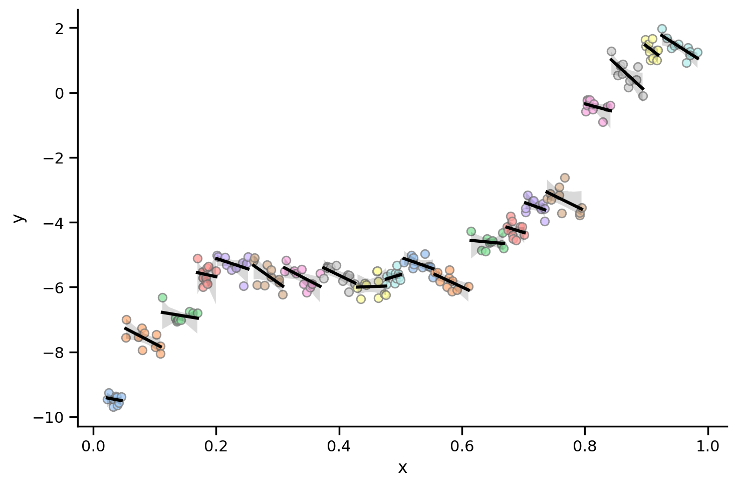
What this plot shows is that for almost all individual participants, the relationship between x and y is negative!
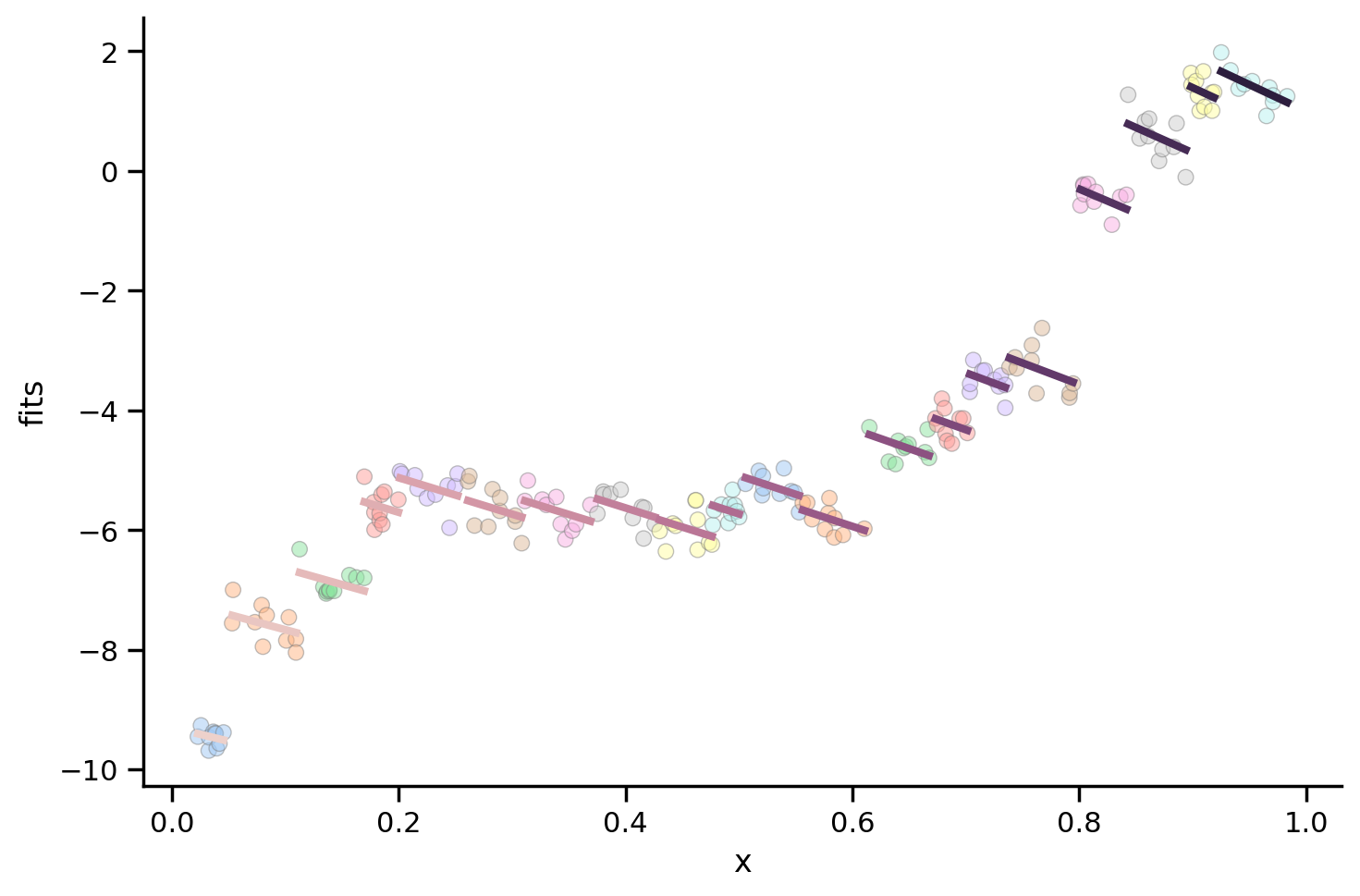
Let’s fit an LMM with random intercepts using pymer4
We can do so by create a model with a formula and some data using the Lmer Python class similar to ols() we’ve been using. We can then call the .fit() method on the model with summarize=True to get estimated parameters.
This is different from ols() where, .fit() returned a results object that we were using for things like .summary() and .parameters.
In pymer4 everything is contained in the model you create with Lmer
We’ll explore this more in the next section, for now let’s take a look at the estimated fixed effect of x
from pymer4.models import Lmer

# Create model
model = Lmer('y ~ x + (x | participant)', data=df_simpson.to_pandas())

# Call fit() to estimate parameters; doesn't return anything!
model.fit()

# Fixed effects and inferential stats
model.coefs
boundary (singular) fit: see help('isSingular')
| Estimate | 2.5_ci | 97.5_ci | SE | DF | T-stat | P-val | Sig | |
|---|---|---|---|---|---|---|---|---|
| (Intercept) | -0.760196 | -3.403647 | 1.883256 | 1.348724 | 13.66477 | -0.563640 | 5.821312e-01 | |
| x | -6.519442 | -8.773135 | -4.265749 | 1.149864 | 92.86580 | -5.669748 | 1.603694e-07 | *** |
As we can see, the fixed effect for x is now negative!
We can plot each participant’s random effect to see this:
# Scatter plot per subject
grid = sns.FacetGrid(data=model.data, height=5, aspect=1.5)
grid.map_dataframe(sns.scatterplot, 'x', 'y', hue='participant', palette='pastel', edgecolor='gray', alpha=0.5);
grid.map_dataframe(sns.lineplot, 'x', 'fits', hue='participant', estimator=None, linewidth=3, color='black');
Different ways to handle dependent data#
Simpson’s paradox shows us that if we don’t properly account for violations for independence we run the risk of making incorrect inferences.
In class we discussed 3 approaches for handing dependent data by aggregation:
Complete pooling: just a single global regression ignoring repeated measures
No pooling: a separate regression per cluster of repeated measures
Partial pooling: a linear mixed effects model
Note: If you want a more causal, accessible (10-15m) reading about this topic, feel free to checkout this older blog post Eshin wrote about repeated measures
Let’s explore this using the Sleep Study data we looked at in class.
This dataset is included with lme4 in R with the following details:
The average reaction time per day (in milliseconds) for subjects in a sleep deprivation study.
Days 0-1 were adaptation and training (T1/T2), day 2 was baseline (B); sleep deprivation started after day 2.
These data are from the study described in Belenky et al. (2003), for the most sleep-deprived group (3 hours time-in-bed) and for the first 10 days of the study, up to the recovery period. The original study analyzed speed (1/(reaction time)) and treated day as a categorical rather than a continuous predictor.
The original paper if you’re interested is:
Gregory Belenky, Nancy J. Wesensten, David R. Thorne, Maria L. Thomas, Helen C. Sing, Daniel P. Redmond, Michael B. Russo and Thomas J. Balkin (2003) Patterns of performance degradation and restoration during sleep restriction and subsequent recovery: a sleep dose-response study. Journal of Sleep Research 12, 1-12.
Let’s load up the data and take a look at the columns it has:
Variable |
Description |
|---|---|
Subject |
Unique Subject ID |
Limit |
Number of Days of sleep deprivation |
Reaction |
Subject’s Reaction time in ms |
df = pl.read_csv('data/sleep.csv')
df.head()
| Subject | Days | Reaction |
|---|---|---|
| i64 | i64 | f64 |
| 308 | 0 | 249.56 |
| 308 | 1 | 258.7047 |
| 308 | 2 | 250.8006 |
| 308 | 3 | 321.4398 |
| 308 | 4 | 356.8519 |
Mini-challenge: How many days of sleep deprivation are there per subject?
# Solution
df.group_by('Subject').len()['len'].unique()
| len |
|---|
| u32 |
| 10 |
Mini-challenge: How many unique subjects are there?
# Solution
df['Subject'].n_unique()
18
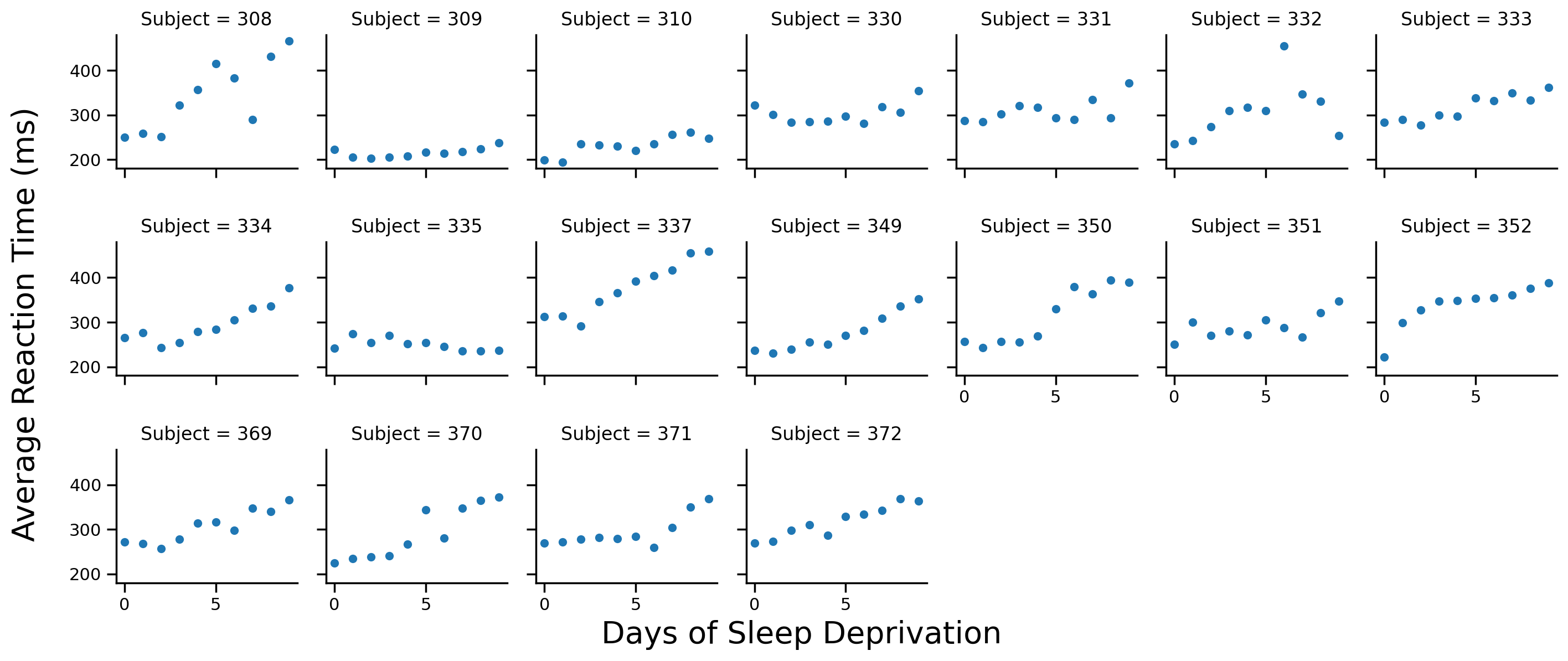
Let’s start by visualizing the data. We’ll create a FacetGrid using seaborn and plot each participant’s data on a separate facet
Note: we’re not currently using the full dataset with 2 participants who had incomplete observations
# Scatter plot per subject
grid = sns.FacetGrid(data=df.to_pandas(), col='Subject', col_wrap=7, height=2)
grid.map(sns.scatterplot, 'Days', 'Reaction')

# Labels
grid.set_axis_labels('','')
grid.figure.supxlabel('Days of Sleep Deprivation', fontsize=20)
grid.figure.supylabel('Average Reaction Time (ms)', x=-.01, fontsize=20);
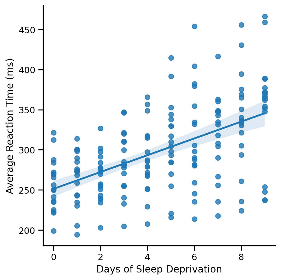
1) Complete Pooling: Good ‘ole OLS#
Complete pooling ignores the fact that we have multiple observations per Subject and just fits a regular ‘ole regression to all the data
Mini-challenge: Use seaborn to plot the global regression line across all data points
# Solution
grid = sns.lmplot(data=df.to_pandas(), x='Days', y='Reaction')
grid.set_axis_labels("Days of Sleep Deprivation", "Average Reaction Time (ms)");
Min-challenge: Use ols to estimate a complete pooling model.
Save the output of .fit() to a variable called model_cp
# Solution
model_cp = ols('Reaction ~ Days', data=df.to_pandas()).fit()
If we examine the parameters of the model you fit, we see how just a single intercept and slope is estimate across all subjects.
This is as if all the data came from 1 subject!
# Note if this gives you an error, you may have have not saved the output of `.fit()` to a variable called `model_cp`
model_cp.params
Intercept    251.405105
Days          10.467286
dtype: float64
Let’s visualize the regression line for each subject. We’ll define a helper function below and add it to our FacetGrid
# Helper function
def plot_cp(x, **kwargs):
    """Plot a line from slope and intercept of model_cp"""
    intercept = model_cp.params['Intercept']
    slope = model_cp.params['Days']
    y_vals = intercept + slope * x
    plt.plot(x, y_vals, '-', color='k')
# Scatter plot per subject
grid = sns.FacetGrid(data=df.to_pandas(), col='Subject', col_wrap=7, height=2)
grid.map(sns.scatterplot, 'Days', 'Reaction')

# Add regression line to each subplot
# It's the same for all subjects
grid.map(plot_cp,'Days')

# Labels
grid.set_axis_labels('','')
grid.figure.supxlabel('Days of Sleep Deprivation', fontsize=20)
grid.figure.supylabel('Average Reaction Time (ms)', x=-.01, fontsize=20);
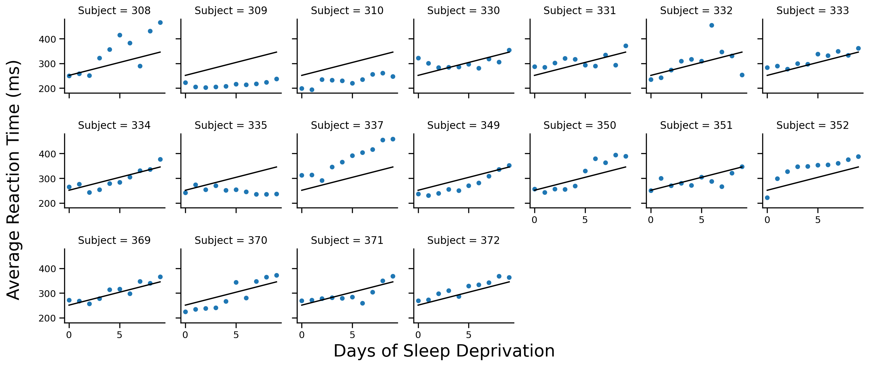
Notice how each Subject has the same regression line
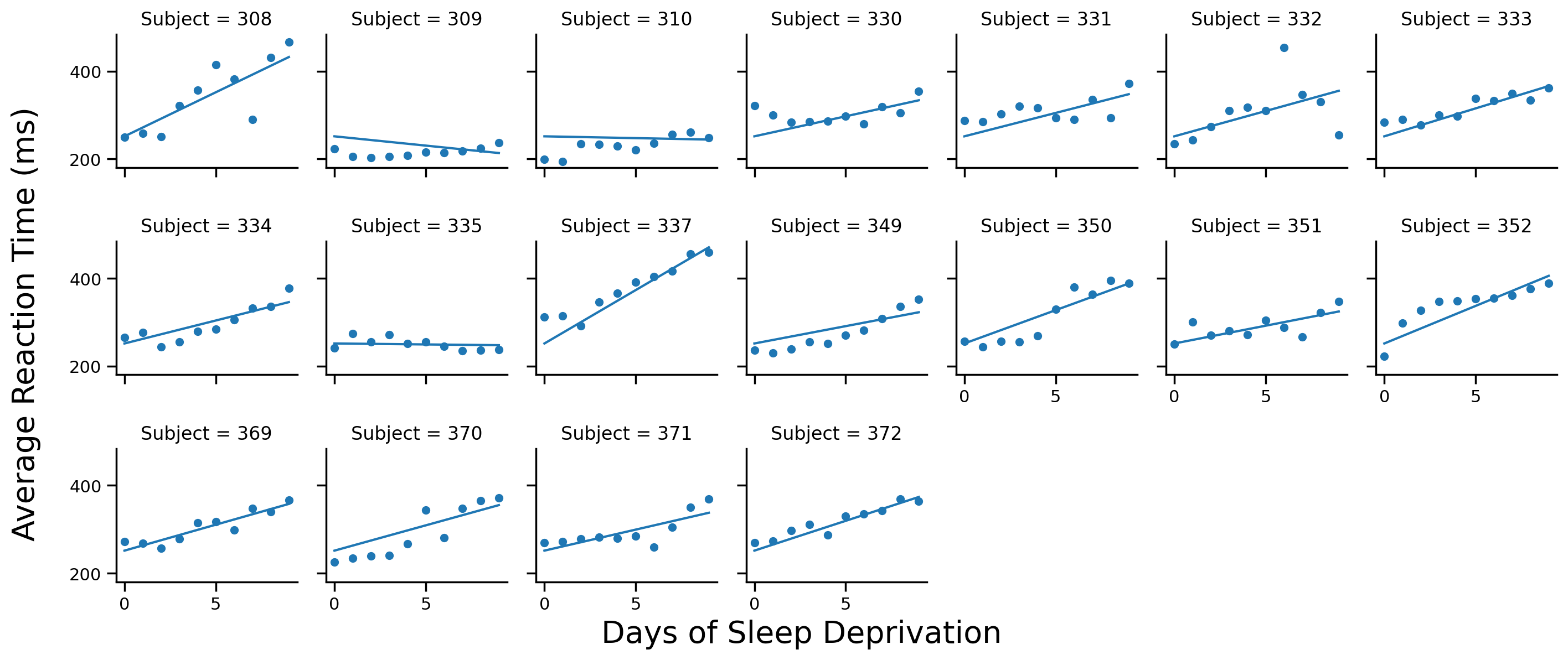
2) No Pooling: OLS per Subject#
If we don’t pool our data at all, it’s like estimating a separate ols per Subject
pymer4 includes a special model called Lm2 that does exactly this. It works just like ols() but also takes group argument for the variable we should separate the data by and run separate regressions:
# Import it
from pymer4.models import Lm2

# Create model
model_np = Lm2('Reaction ~ Days', group='Subject', data=df.to_pandas())

# Fit it
model_np.fit()
Every model that pymer4 estimates includes a .data attribute with the original data and the fits and residuals from the model:
Note: data are stored as Dataframe using the pandas library NOT polars that we’ve been using. Remember you can always convert it into a polars Dataframe by wrapping it in pl.DataFrame(). We don’t need to do that at the moment as both libraries have a .head() method
model_np.data.head()
| Subject | Days | Reaction | residuals | fits | |
|---|---|---|---|---|---|
| 0 | 308 | 0 | 249.5600 | 5.367331 | 244.192669 |
| 1 | 308 | 1 | 258.7047 | -7.252672 | 265.957372 |
| 2 | 308 | 2 | 250.8006 | -36.921474 | 287.722074 |
| 3 | 308 | 3 | 321.4398 | 11.953024 | 309.486776 |
| 4 | 308 | 4 | 356.8519 | 25.600421 | 331.251479 |
We can use this DataFrame to add each Subject’s fit to their scatterplot
# Scatter plot per subject
grid = sns.FacetGrid(data=model_np.data, col='Subject', col_wrap=7, height=2)
grid.map(sns.scatterplot, 'Days', 'Reaction')

# Add regression line to each subplot
# Now each subject has their own regression line
grid.map(sns.lineplot, 'Days', 'fits')

# Labels
grid.set_axis_labels('','')
grid.figure.supxlabel('Days of Sleep Deprivation', fontsize=20)
grid.figure.supylabel('Average Reaction Time (ms)', x=-.01, fontsize=20);
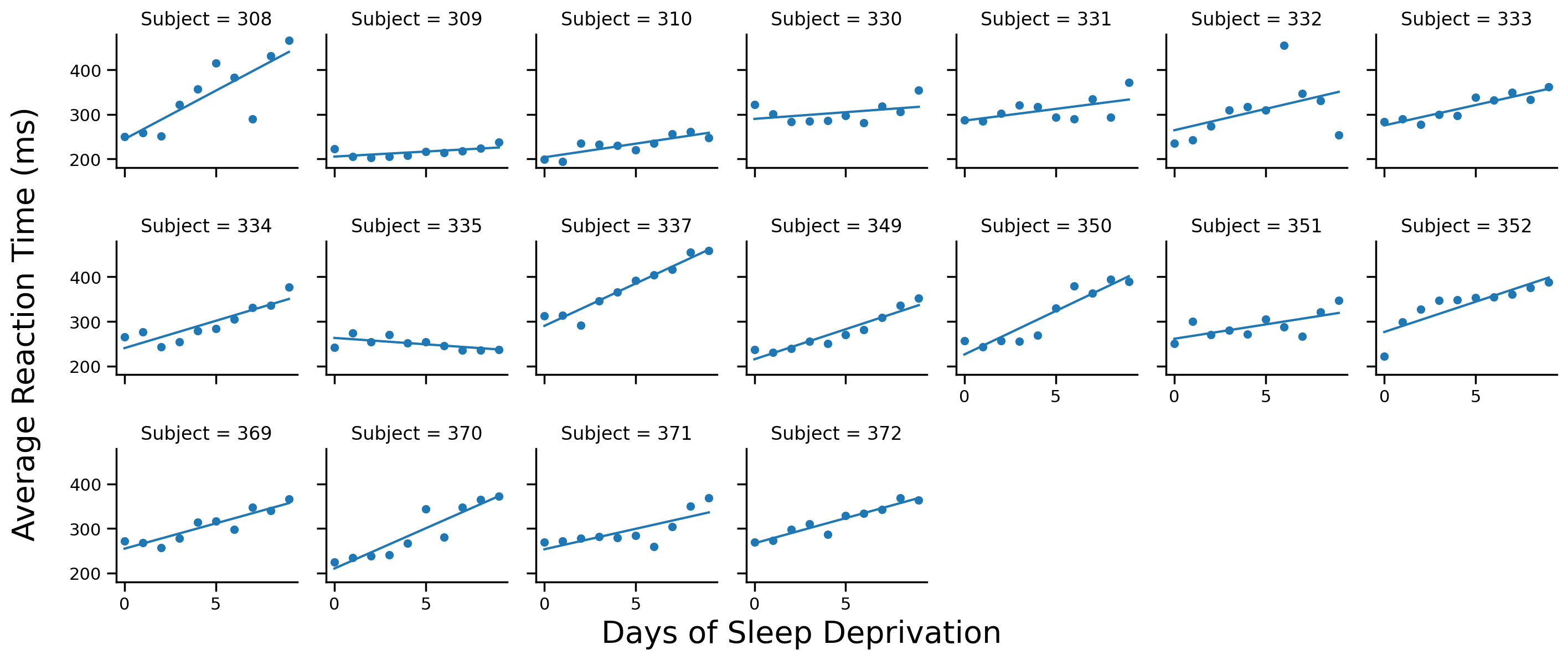
Mini-challenge: Compare the figure we just made to the one from our complete pooling model. Write a sentence or two on how they’re the same or different
Your response here
We can also do the same thing by writing a for loop and using the ols() function that we’re familiar with, but it’s a bit more involved:
# To store each subject's parameters and fits/residuals
params = []
fits_resids = []

# Loop over each subject
for subjectID in df['Subject'].unique():
    # Filter data for current subject
    subject_data = df.filter(col('Subject') == subjectID).to_pandas()

    # Fit model
    subject_model = ols('Reaction ~ Days', data=subject_data).fit()

    # Grab subject estimates, add subject ID, and store it
    subject_params = subject_model.params.to_dict()
    subject_params['Subject'] = subjectID
    params.append(subject_params)

    # Grab model fits and residuals and store them
    subject_fits_resids = pl.DataFrame({
        'Subject': np.repeat(subjectID, len(subject_data)),
        'Days': subject_data['Days'].to_numpy(),
        'fits': subject_model.fittedvalues.to_numpy().astype(float),
        'resid': subject_model.resid.to_numpy().astype(float)})

    fits_resids.append(subject_fits_resids)

# Combine into DataFrames
params = pl.DataFrame(params)[['Subject', 'Intercept', 'Days']]
fits_resids = pl.concat(fits_resids)

# Combine with original data
df_np = df.join(fits_resids, on=['Subject','Days'])
# Scatter plot per subject
grid = sns.FacetGrid(data=df_np.to_pandas(), col='Subject', col_wrap=7, height=2)
grid.map(sns.scatterplot, 'Days', 'Reaction')

# Add regression line to each subplot
# Each subject has their own regression line
grid.map(sns.lineplot, 'Days', 'fits')

# Labels
grid.set_axis_labels('','')
grid.figure.supxlabel('Days of Sleep Deprivation', fontsize=20)
grid.figure.supylabel('Average Reaction Time (ms)', x=-.01, fontsize=20);
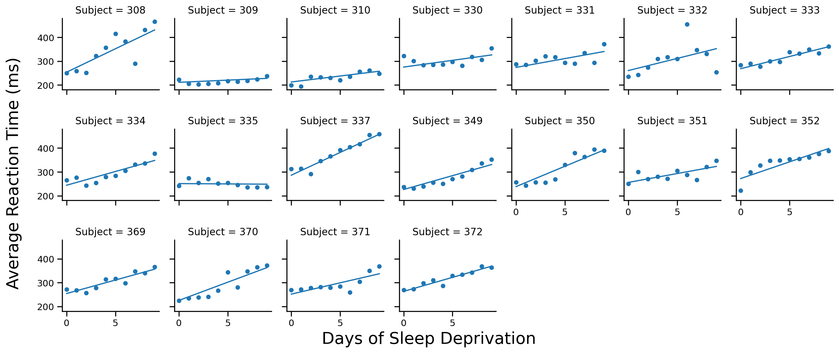
3) Partial Pooling: Linear Mixed Models#
Partial pooling models are the best of both worlds - intuitively you can think about them is half-way between our complete and unpooled approaches.
Instead of ignore or splitting up our dataset, we explicitly model the dependence using 2 components:
Fixed effects which capture the general effect we’re interested in: \(\text{Reaction} \sim \text{Days}\)
Random effects which capture the variance around the fixed effects; specifically how each Subject’s intercept and/or slope deviates from the fixed effects
Linear Mixed Models: Meet Lmer#
To estimate an LMM we can use the Lmer() class from pymer4. We provide it a formula and data like before, but this time we also specify the random effects we want to estimate using the following syntax
Random Effects Syntax#

Key Attributes#
Lmer models have the following attributes that make it easier to work with model results:
.coefs- summary output table;summary(model)in R.fixef- cluster level estimates;coef(model)in R.ranef- cluster level deviances;ranef(model)in R.design_matrix- model design matrix.data- original data augmented with columns offitsandresiduals
Random Intercepts Only#
Let’s estimate an LMM with random intercepts per Subject
Providing summarize=True to .fit() will automatically print out an R like summary:
from pymer4.models import Lmer

model_pp_i = Lmer('Reaction ~ Days + (1 | Subject)', data=df.to_pandas())
model_pp_i.fit(summarize=True)
Linear mixed model fit by REML [’lmerMod’]
Formula: Reaction~Days+(1|Subject)

Family: gaussian	 Inference: parametric

Number of observations: 180	 Groups: {'Subject': 18.0}

Log-likelihood: -893.233 	 AIC: 1794.465

Random effects:

                 Name       Var     Std
Subject   (Intercept)  1378.179  37.124
Residual                960.457  30.991

No random effect correlations specified

Fixed effects:
| Estimate | 2.5_ci | 97.5_ci | SE | DF | T-stat | P-val | Sig | |
|---|---|---|---|---|---|---|---|---|
| (Intercept) | 251.405 | 232.302 | 270.508 | 9.747 | 22.81 | 25.794 | 0.0 | *** |
| Days | 10.467 | 8.891 | 12.044 | 0.804 | 161.00 | 13.015 | 0.0 | *** |
This outputs lots of information about the model, as well as a classic summary table with t-stats, CIs, and p-values for fixed effects:
Formula: model formula you used
Family: the type of distribution we’re assuming
Inference: how we’re calculating p-values
Log-likelihood/AIC: measures of model fit that we can use to compare to other models
Random effects: the variance of the rfx you specified (only intercept in this case)
Using the .coefs attribute we can just look at the fixed effects summary.
You’ll notice that our degrees-of-freedom are no longer nice round numbers, but include decimal places. That’s because pymer4 uses both the lme4 R library and the lmerTest R library which calculate p-values using Satterthwaite approximated degrees of freedom.
model_pp_i.coefs
| Estimate | 2.5_ci | 97.5_ci | SE | DF | T-stat | P-val | Sig | |
|---|---|---|---|---|---|---|---|---|
| (Intercept) | 251.405105 | 232.301892 | 270.508318 | 9.746716 | 22.810199 | 25.793826 | 2.241351e-18 | *** |
| Days | 10.467286 | 8.891041 | 12.043531 | 0.804221 | 161.000000 | 13.015428 | 6.412601e-27 | *** |
Comparing models#
We can also compare this to the model-comparison approach we’ve learned about before
To do this in pymer4 we use the lrt() function which is like the anova_lm() function that we’re familiar with. Just pass it 1 or models and it will test whether the difference in parameters is worth it
from pymer4.stats import lrt

# Drop the Days term
model_pp_null = Lmer('Reaction ~ 1 + (1 | Subject)', data=df.to_pandas())
model_pp_null.fit()

# Compare models to see if including Days as a fixed effect is worth it
lrt(model_pp_null, model_pp_i)
refitting model(s) with ML (instead of REML)
| model | npar | AIC | BIC | log-likelihood | deviance | Chisq | Df | P-val | Sig | |
|---|---|---|---|---|---|---|---|---|---|---|
| 0 | Reaction~1+(1|Subject) | 3 | 1916.541058 | 1926.119929 | -955.270529 | 1910.541058 | ||||
| 1 | Reaction~Days+(1|Subject) | 4 | 1802.078643 | 1814.850470 | -897.039322 | 1794.078643 | 116.462415 | 1.0 | 0.0 | *** |
Inspecting coefficients#
We can inspect the random effects using .ranef and .fixef
.ranef: Subject level deviances from.coef.fixef: Subject level estimates =.coef+.ranef
Below we see the 20 deviances for the fixed effect intercept term: 1 per Subject
# intercept deviances per subject
model_pp_i.ranef
| X.Intercept. | |
|---|---|
| 308 | 40.783710 |
| 309 | -77.849554 |
| 310 | -63.108567 |
| 330 | 4.406442 |
| 331 | 10.216189 |
| 332 | 8.221238 |
| 333 | 16.500494 |
| 334 | -2.996981 |
| 335 | -45.282127 |
| 337 | 72.182686 |
| 349 | -21.196249 |
| 350 | 14.111363 |
| 351 | -7.862221 |
| 352 | 36.378425 |
| 369 | 7.036381 |
| 370 | -6.362703 |
| 371 | -3.294273 |
| 372 | 18.115747 |
And if we combine these with our fixed effects we can calculate our 20 different parameter estimates per Subject, similar to our unpooled approach
Notice that because we only estimated random intercepts, all subjects have the same slope for Days!
# intercepts and slopes per subject
model_pp_i.fixef
| (Intercept) | Days | |
|---|---|---|
| 308 | 292.188815 | 10.467286 |
| 309 | 173.555551 | 10.467286 |
| 310 | 188.296537 | 10.467286 |
| 330 | 255.811547 | 10.467286 |
| 331 | 261.621294 | 10.467286 |
| 332 | 259.626343 | 10.467286 |
| 333 | 267.905599 | 10.467286 |
| 334 | 248.408124 | 10.467286 |
| 335 | 206.122978 | 10.467286 |
| 337 | 323.587791 | 10.467286 |
| 349 | 230.208856 | 10.467286 |
| 350 | 265.516468 | 10.467286 |
| 351 | 243.542884 | 10.467286 |
| 352 | 287.783530 | 10.467286 |
| 369 | 258.441486 | 10.467286 |
| 370 | 245.042402 | 10.467286 |
| 371 | 248.110832 | 10.467286 |
| 372 | 269.520852 | 10.467286 |
Challenge#
Using the examples you seen so far try to complete the following challenges
Random Slopes Only#
Reference the Random Effects Syntax table above to estimate a model that only includes random slopes per Subject
# Solution
model_s = Lmer('Reaction ~ Days + (0 + Days | Subject)', data=df.to_pandas())
model_s.fit()
Using the .data attribute of the model and the examples above plot each Subject’s data on a different facet along with their estimated regression lines
# Solution
# Scatter plot per subject
grid = sns.FacetGrid(data=model_s.data, col='Subject', col_wrap=7, height=2)
grid.map(sns.scatterplot, 'Days', 'Reaction')

# Add regression line to each subplot
grid.map(sns.lineplot, 'Days', 'fits')

# Labels
grid.set_axis_labels('','')
grid.figure.supxlabel('Days of Sleep Deprivation', fontsize=20)
grid.figure.supylabel('Average Reaction Time (ms)', x=-.01, fontsize=20);
Random Intercepts & Slopes#
Reference the Random Effects Syntax table above to estimate a model that includes correlated random intercepts & slopes per Subject
# Solution
model_is = Lmer('Reaction ~ Days + (1 + Days | Subject)', data=df.to_pandas())
model_is.fit()
Using the .data attribute of the model and the examples above plot each Subject’s data on a different facet along with their estimated regression lines
# Solution
# Scatter plot per subject
grid = sns.FacetGrid(data=model_is.data, col='Subject', col_wrap=7, height=2)
grid.map(sns.scatterplot, 'Days', 'Reaction')

# Add regression line to each subplot
grid.map(sns.lineplot, 'Days', 'fits')

# Labels
grid.set_axis_labels('','')
grid.figure.supxlabel('Days of Sleep Deprivation', fontsize=20)
grid.figure.supylabel('Average Reaction Time (ms)', x=-.01, fontsize=20);
Model Comparison#
Using the earlier example as a guide, use the lrt() function to compare all 3 mixed effects models. Which random-effects structure seems worth it?
# Your code here
lrt(model_s, model_is)
refitting model(s) with ML (instead of REML)
| model | npar | AIC | BIC | log-likelihood | deviance | Chisq | Df | P-val | Sig | |
|---|---|---|---|---|---|---|---|---|---|---|
| 0 | Reaction~Days+(0+Days|Subject) | 4 | 1782.080315 | 1794.852143 | -887.040158 | 1774.080315 | ||||
| 1 | Reaction~Days+(1+Days|Subject) | 6 | 1763.939344 | 1783.097086 | -875.969672 | 1751.939344 | 22.140971 | 2.0 | 0.000016 | *** |
Your response here